High Profile Responsive Website
Metra
Challenge
This high profile site had various challenges including understand Metra's complex systems, organizing Metra's content and working with Adobe CQ's CMS template limitations.
Role
- Conducted content audit
- Reorganized information architecture
- Made copy more user friendly
- Created wireframes
- Designed user interaction
- Provided art direction
Results
Designed a clean, responsive site using 3 breakpoints which made it easier for users to find their train lines as well as highly impress Metra's CEO Donald Orseno.
Sitemap
One of the main challenges was the content audit. There was so much content and not organized in a way which made it easy for Metra riders to find and use.
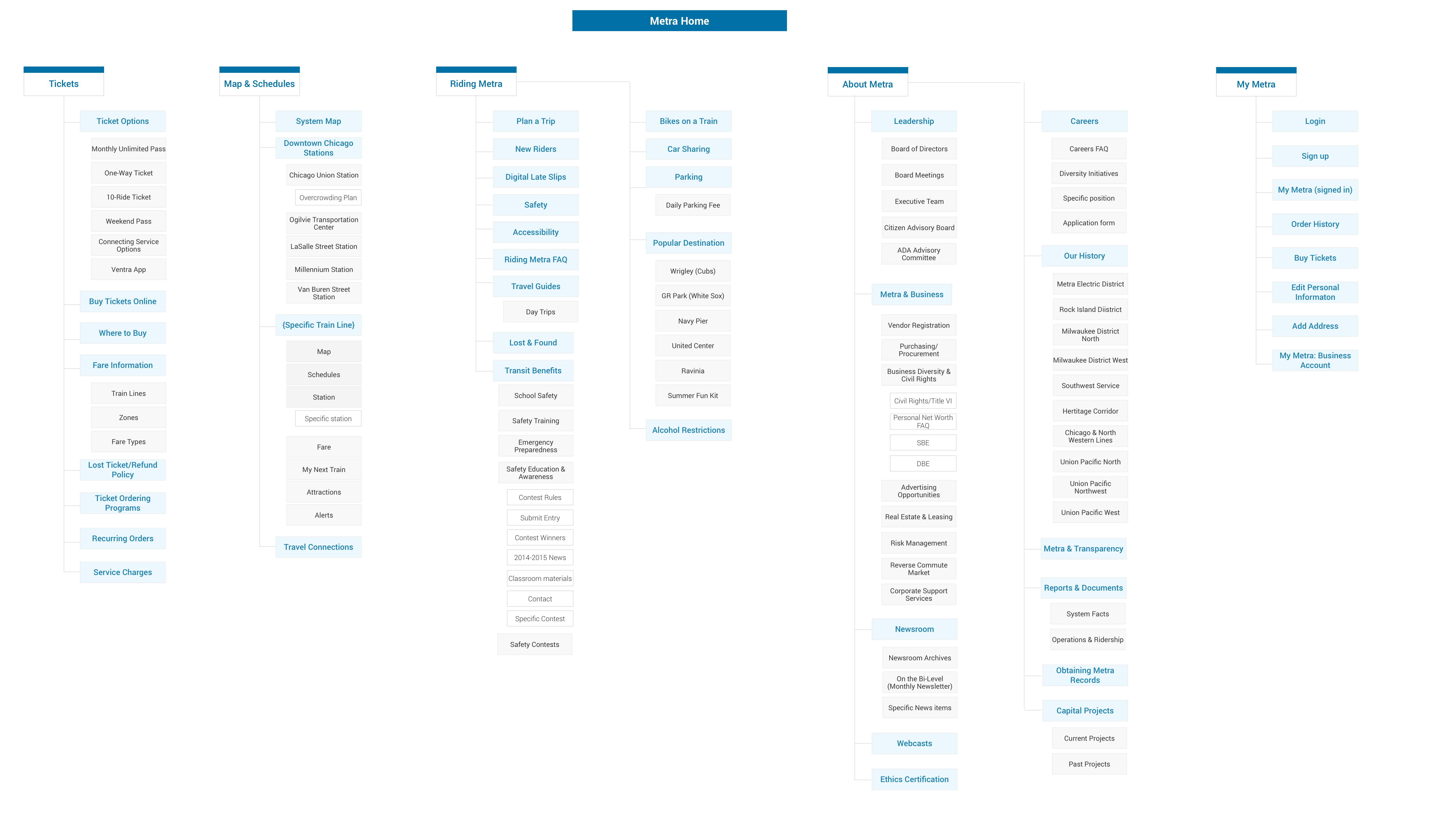
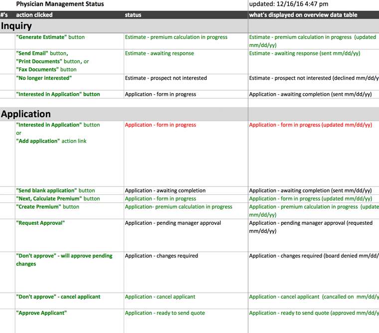
1) Paired down main nav by reducing numbers of choices from 6 to 4
2) Moved many of sub navigation items that most everyday riders wouldn’t be looking for to the footer
3) Created mega menu on desktop view to quickly help direct riders towards the information they’re seeking
4) Designed a truly responsive site based on 3 breakpoints, desktop, tablet, and mobile
Wires
The idea was to allow new or existing riders to quickly find what time their train was departing and if there were any delays.
To make it easier for users, I grouped the trains by location and sorted each train by stop.

Features a streamlined navigation, a “Track your Train” module, and a compact yet expandable service alerts section grouped by train line.
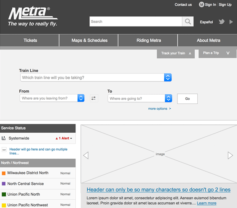
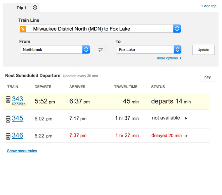
This module allowed riders to quickly find what time their train was departing and if there were any delays. Two new key usability improvements were to group the lines by direction (North/Northwest, South/ Southwest, and West) and to list the final destination for each line to make it more clear which train to take.
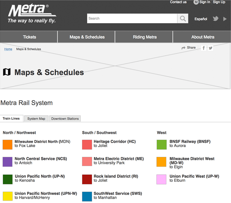
The desktop version contains a mega menu grouped by location and broken down by train line to quickly allow find their train
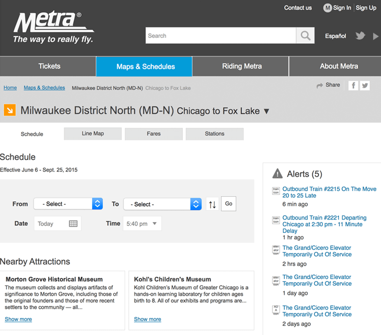
Allows riders to pick their current location, their final destination and then enter when they are leaving so they can find the best train for them.
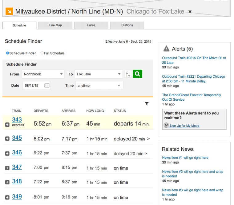
Once the rider selects their line, time & date, they're presented with a list of trains with departure & arrival times so they can choose the best train to take.
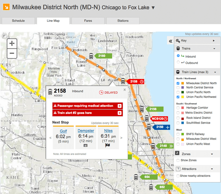
Allows anyone to see where any train is at any time. Shows the next 3 steps as well as the train’s status.
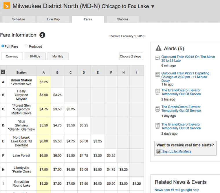
This reorganized fare matrix shows all the pricing clearly broken down by one-way, 10-ride, or monthly.
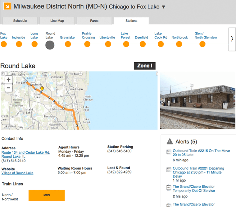
Each station tabs shows the details of each station (address, agent hours, waiting room times and accessibly info). To make it easier for rides each stop would be displayed in order by stop.
Physician Management Web Application
Marsh Clearsight
Challenge
Beaumont Health System was seeking a new system to manage their physician's insurance coverages. Had to understand their business as well as how their system could best integrate into our platform.
Role
- Lead customer interviews
- Diagrammed current state process flow
- Designed suggested process flows
- Created wireframes
- Conducted usability testing
- Provided art direction
Results
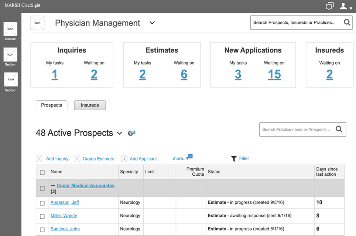
By conducting user research was able to identify, improve, and automate processes as well as design a unique, filterable dashboard which would make it easy for each user to get their most important tasks completed sooner.
URL: Non public - B2B web application
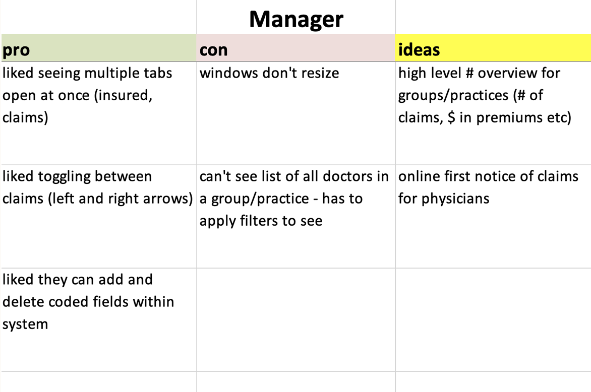
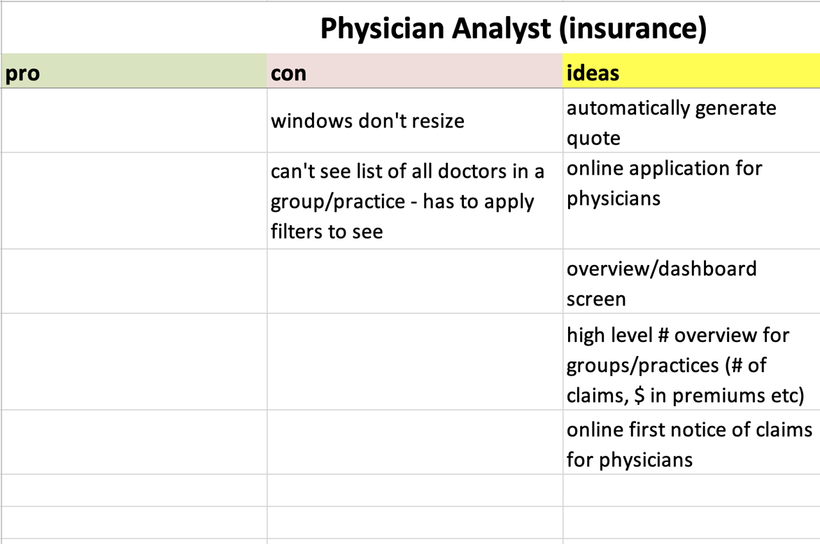
User Research
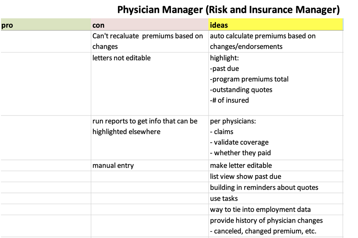
The approach was to conduct remote contextual inquiry. We identified the 3 user types and then had various users from each group walk us through their existing process. We then aggregated their comments along with our observations into 3 groupings - “Pros”, “Cons” and “Ideas” which made it easier to know what was working well and what needed improvement.
Flows & Frames
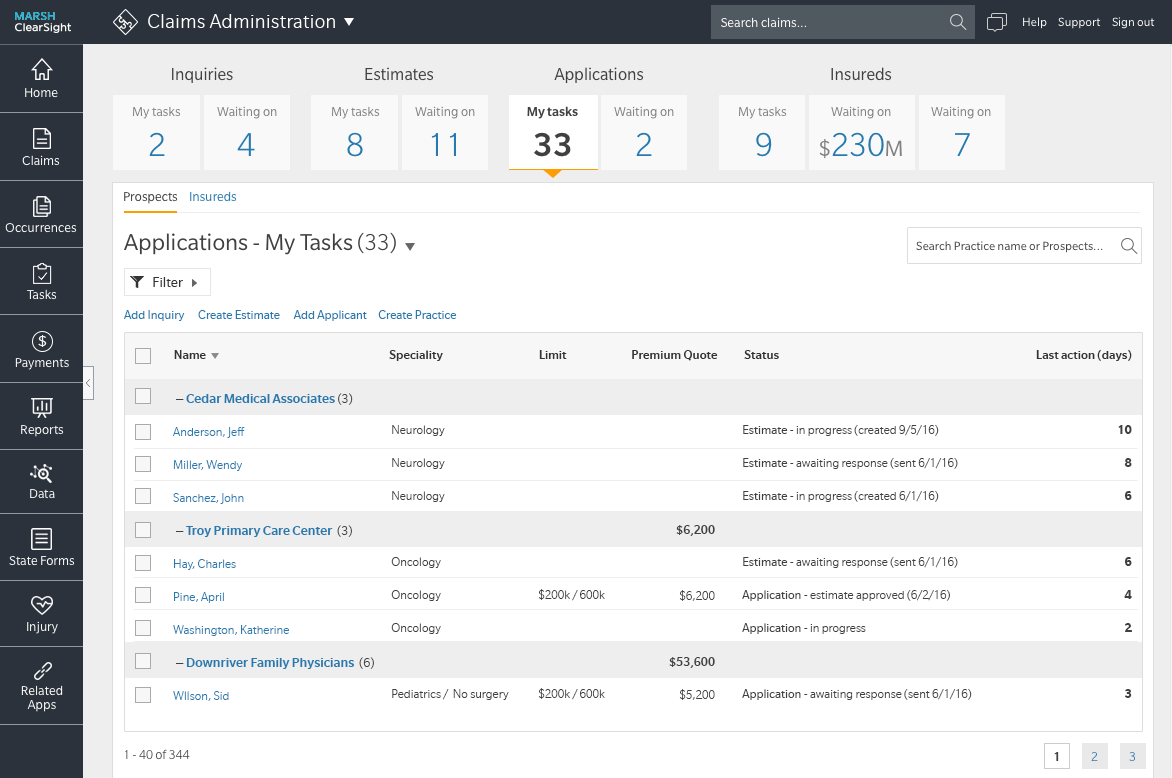
We spent a great deal of time documenting their existing systems process. We then identified business rules for the workflow of application. To reduce manual effort, I designed the system to auto-route tasks to the correct user and make it more clear what the status was and what actions to take.
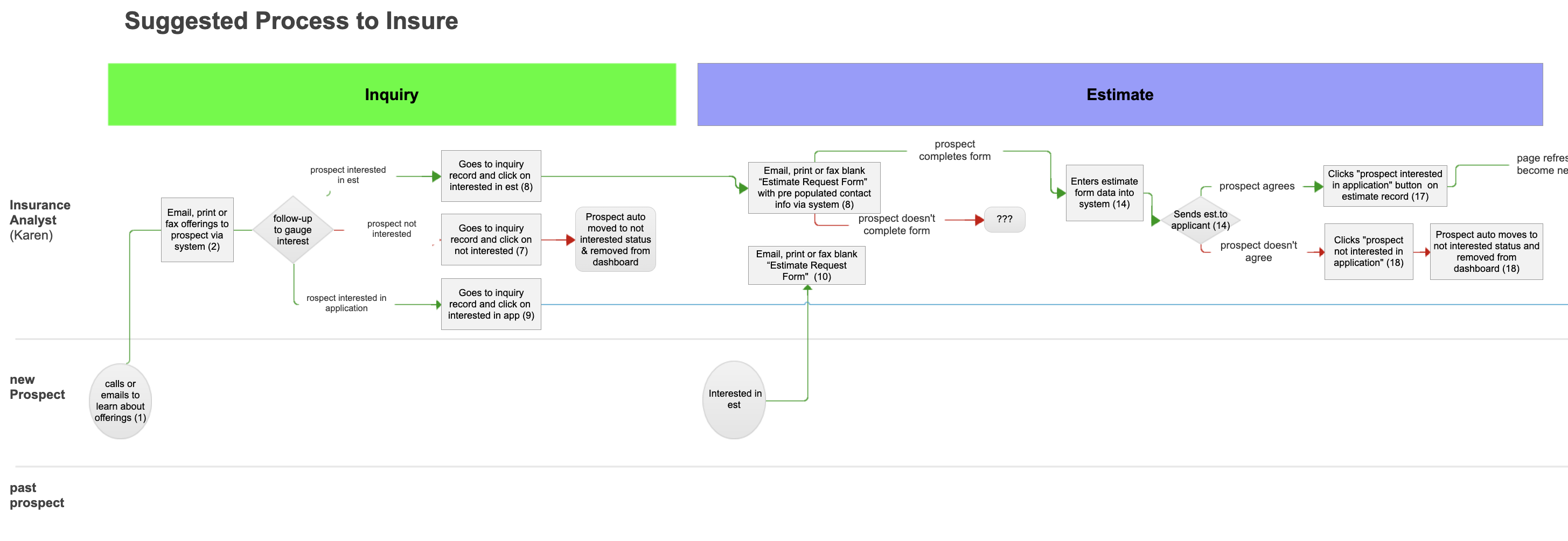
Diagrams a potential flow which exponentially improves existing processes by increasing communication and automates manual processes.
Helped standardize screens and walk through each flow to make sure the flows made sense
These detailed business rules enhanced the workflow of the application by allowing the system to auto-route tasks.
The redesigned process flow helped break the user’s tasks into key phases that aligned to the users (verified by usability testing)
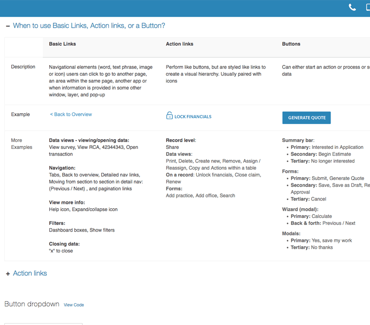
Visuals
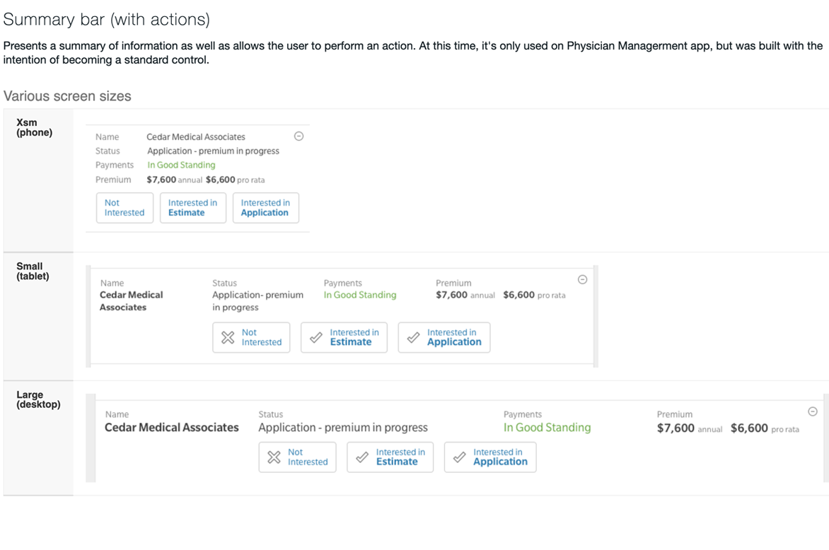
While I wasn't responsible for the visual design, I provided art direction to designer and helped integrate many of the new UI patterns including Dashboard Filters and New Standard Table design
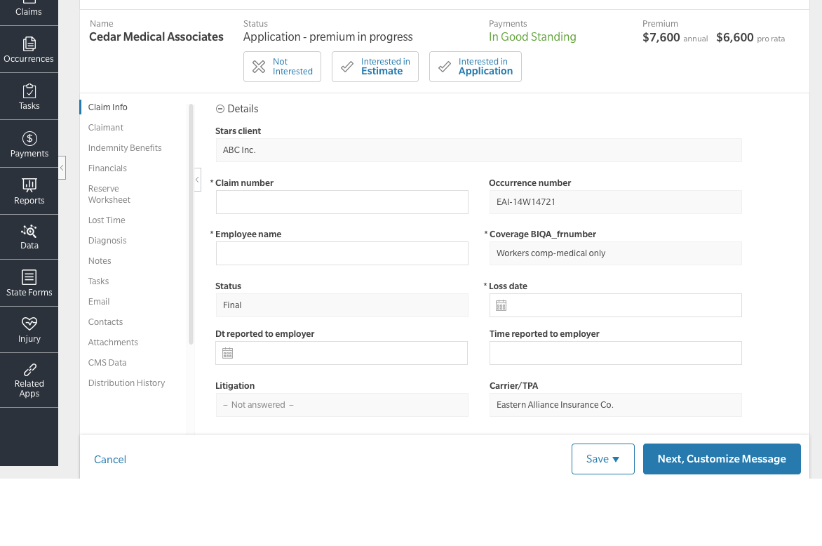
This screen provides many new UI patterns which were to be integrated into the standard framework including Summary Bar with Actions, as well as an improved detail nav
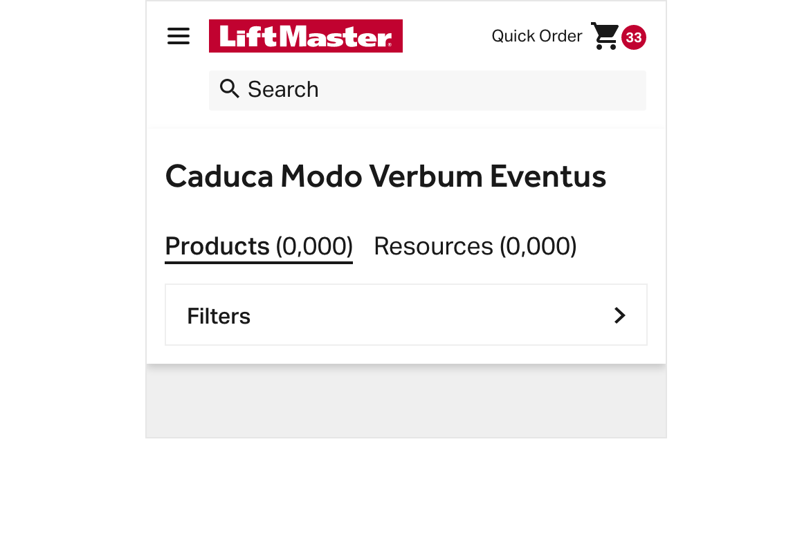
High Profile Responsive E-Commerce Website
LiftMaster Partner Portal
Challenge
This high-profile dealer site had various challenges including an extremely aggressive timeline, limited UX resources, and a backend system which limited ability alter flow and front end changes.
Role
- Created prototypes and participated in remote user testing
- Incorporated user feedback into designs to help improve experiences
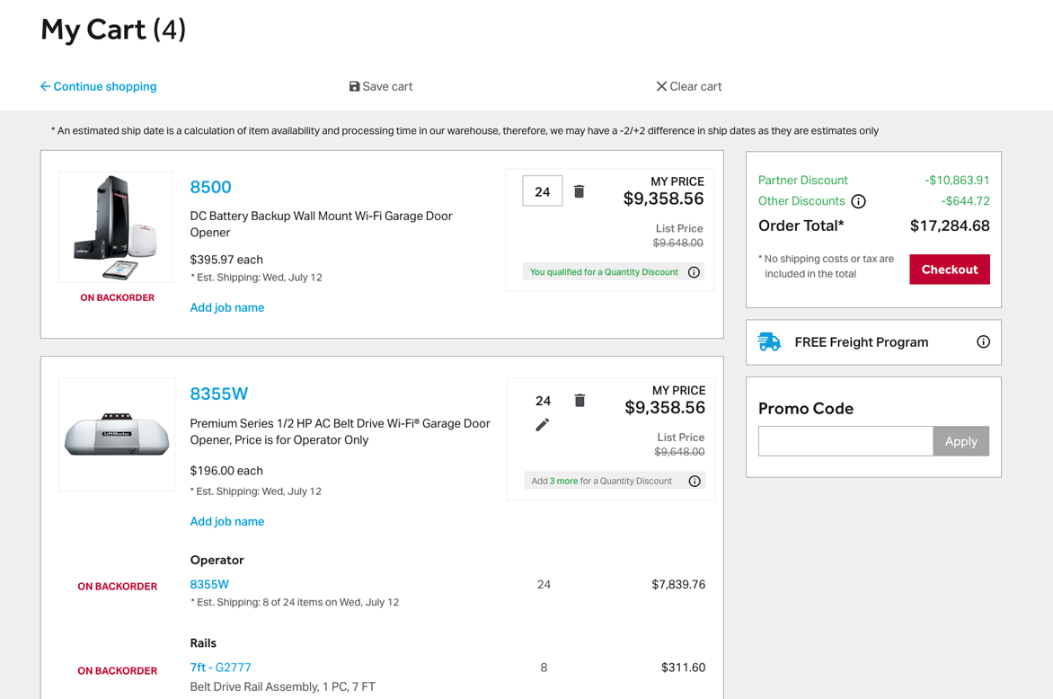
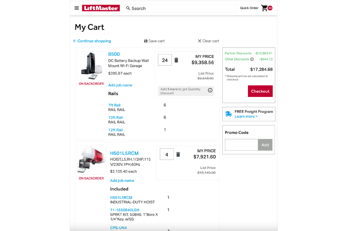
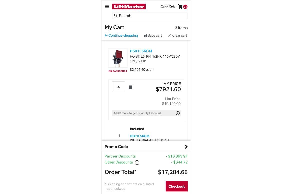
- Created wires for PDP, PLP, Search, Cart and Checkout, Saved carts and Templates, Login and Registration, and Order Management screens
- Assisted with visual design
- Designed components & modules for design system
Results
Designed a clean, responsive site using 3 breakpoints which made it easier for dealers to find and purchase products in a timely matter and resulted in higher customer satisfaction and increased NPS score.
User Research
Created a prototype and utilized the feedback from usability testing as well as some best practices analysis from competitive analysis research to make the designs as user friendly as possible
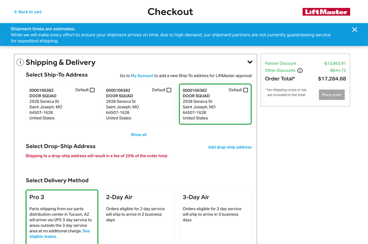
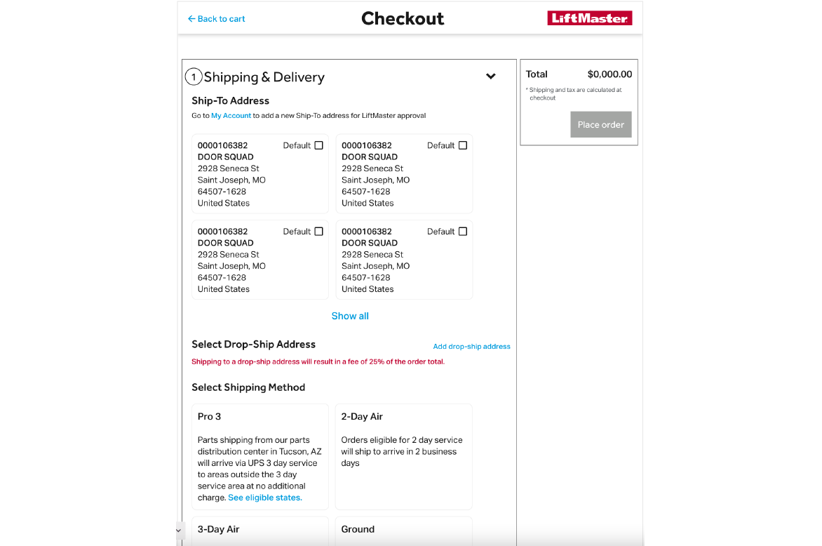
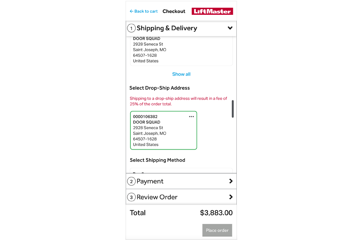
Wires
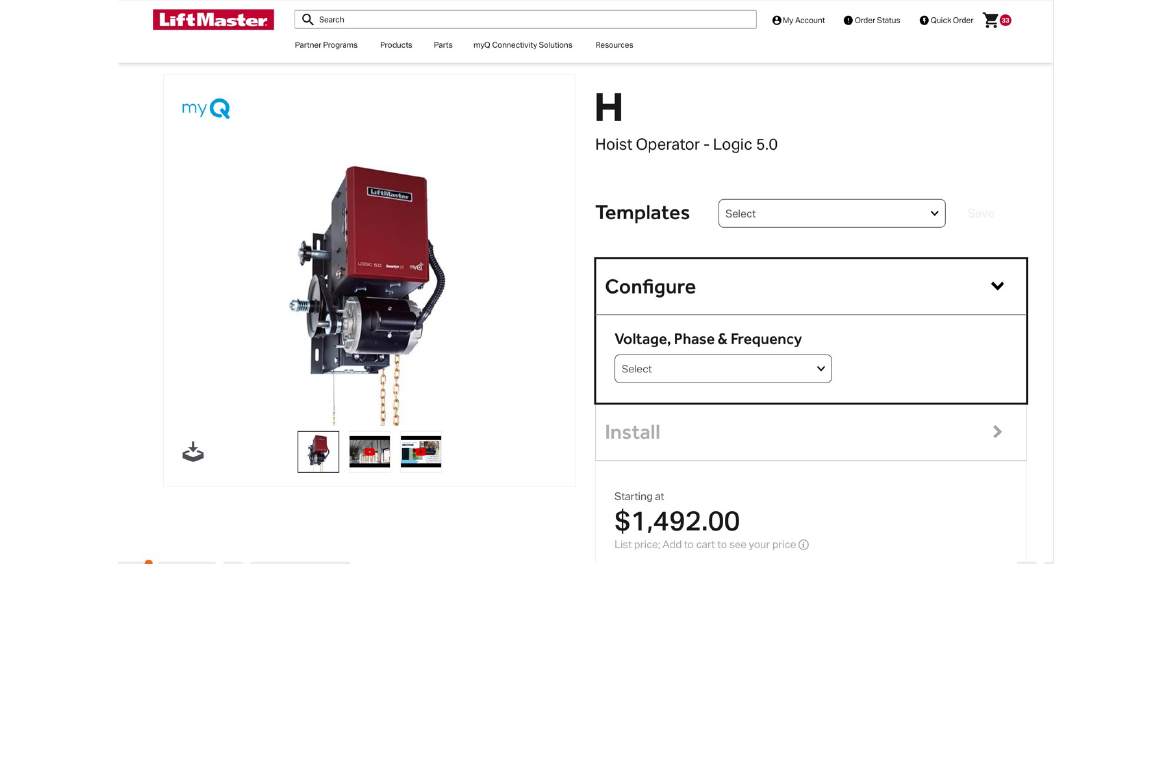
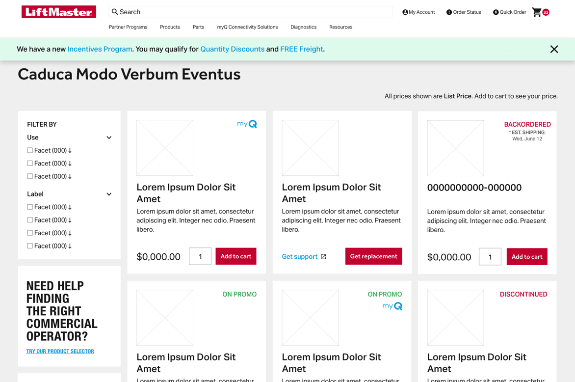
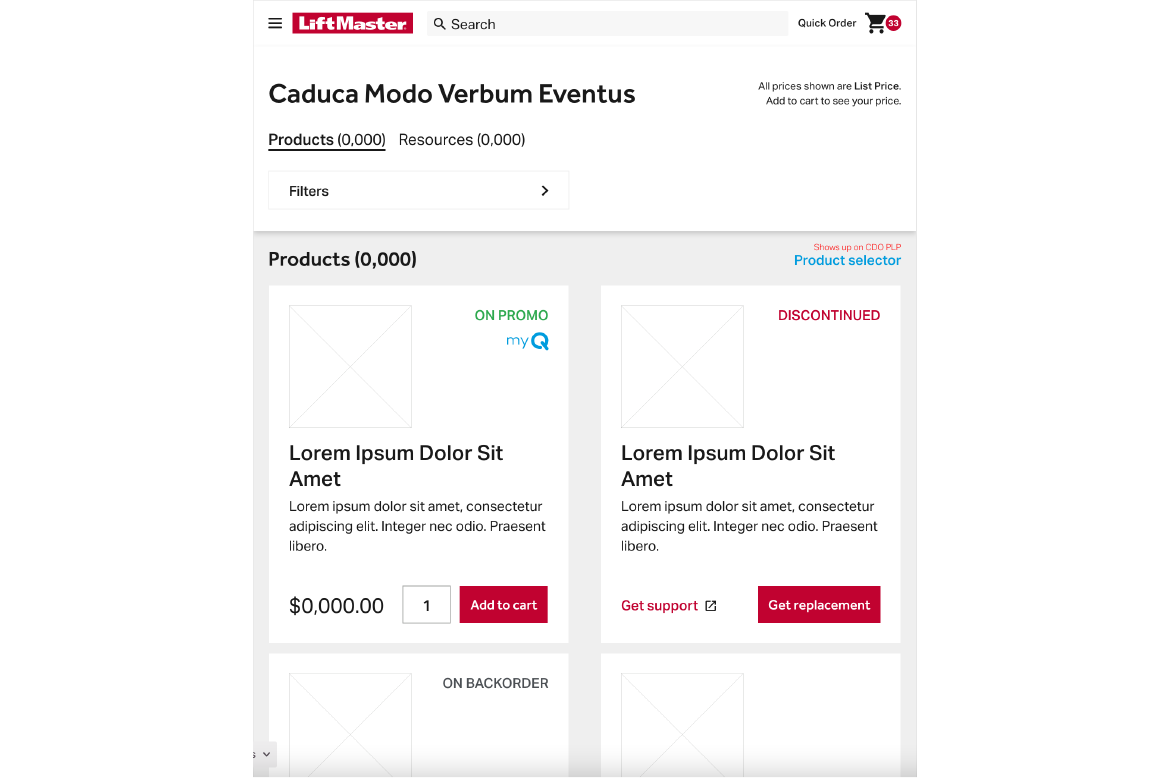
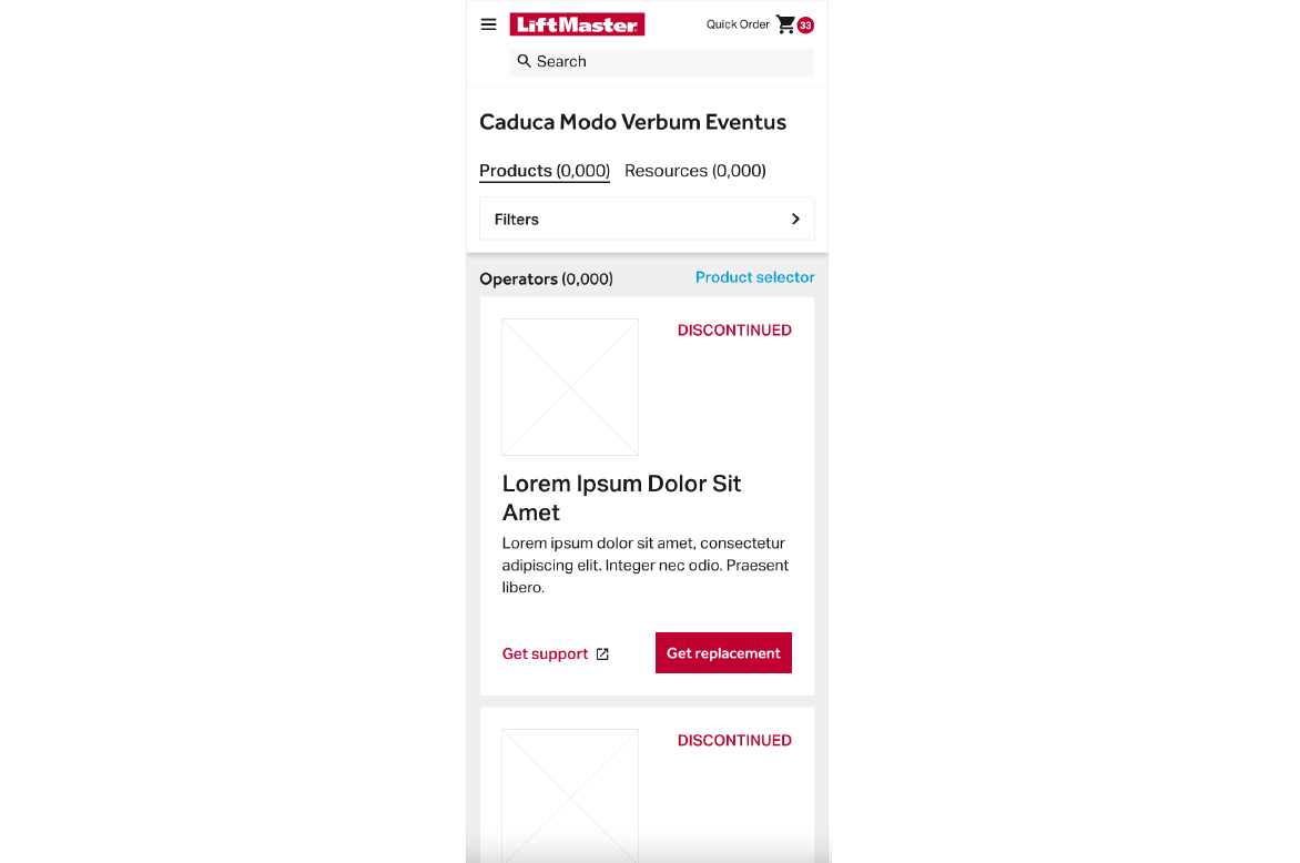
The goal was create the dealer partner portal to make it easier for dealers to find and purchase new products.
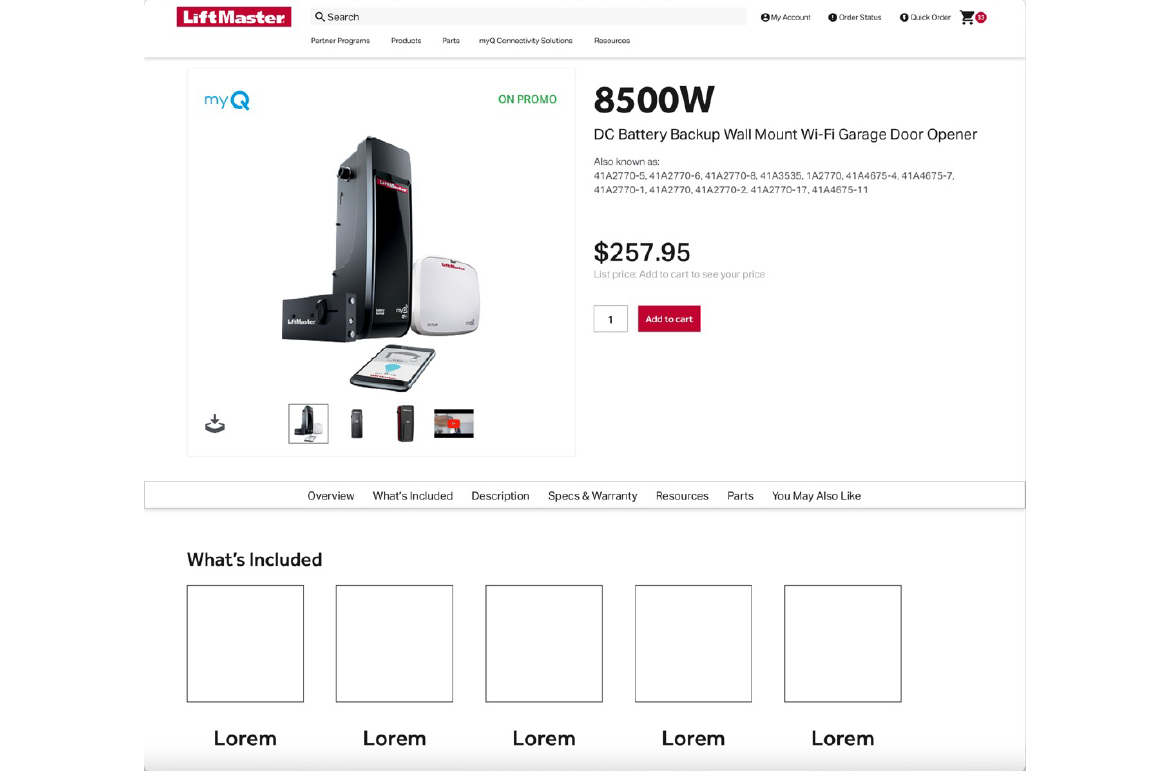
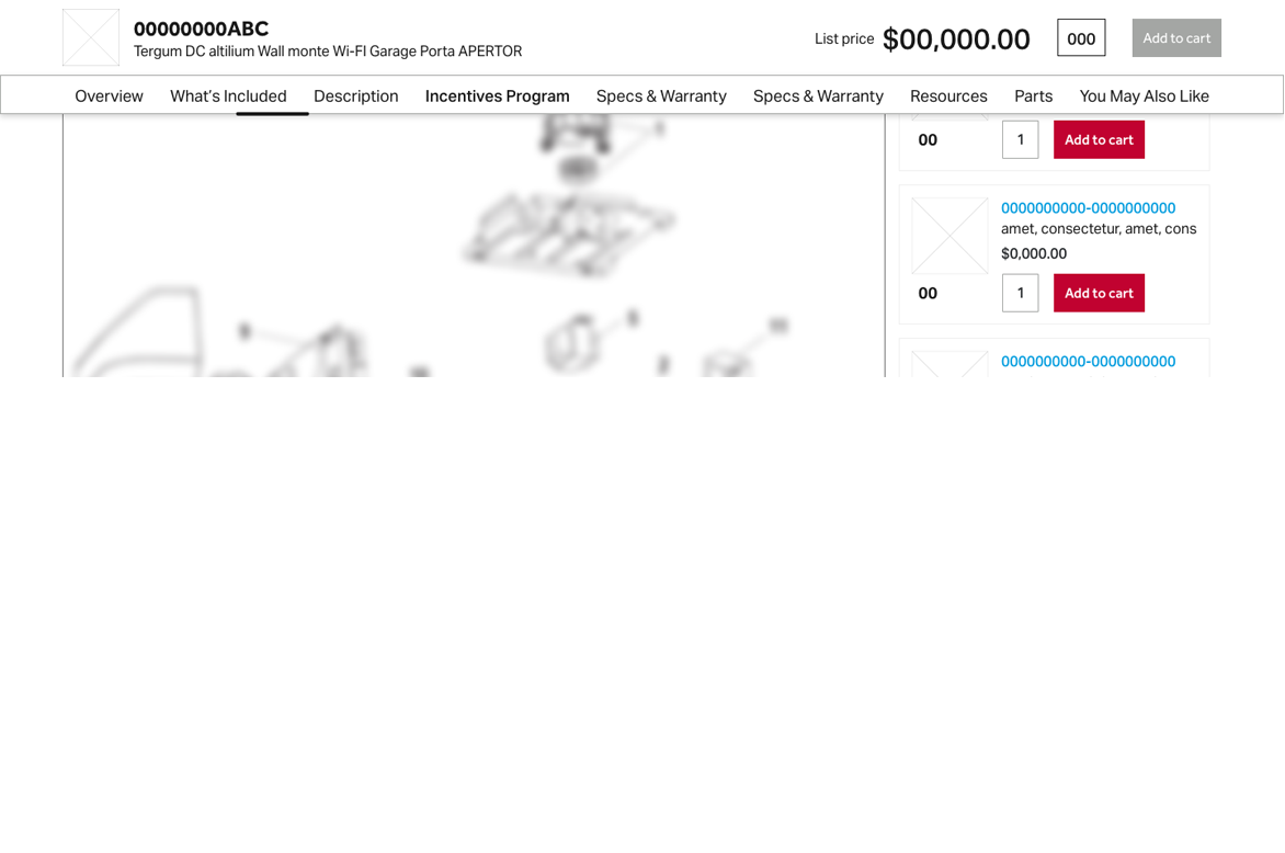
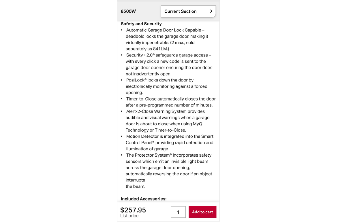
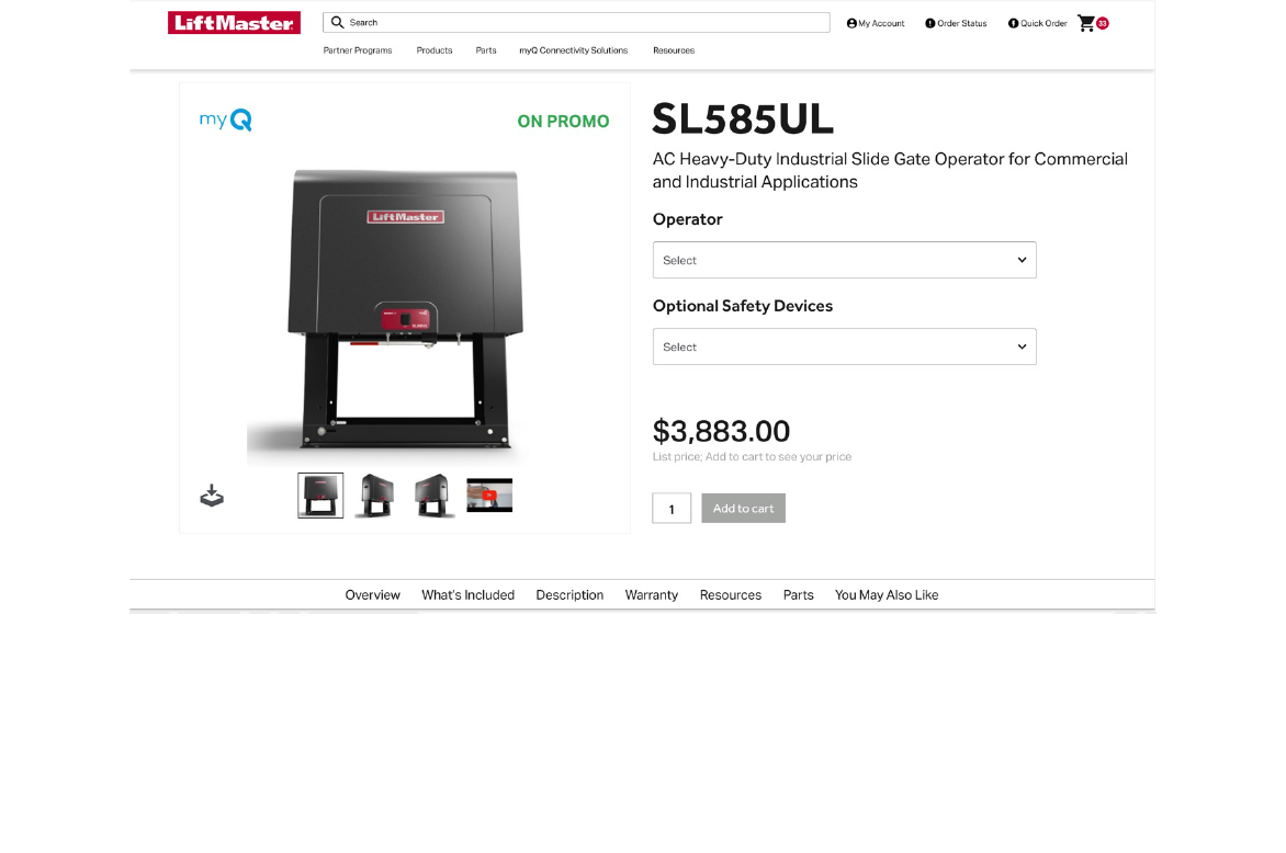
The new clean PDP places the product photos front and center. The product name and description are now displayed in a clear visual hierarchy, and it’s now easier for the customer to view the price and then click the call-to-action button. All PDP’s now contain a sub navigation making it easier to navigate throughout the page.
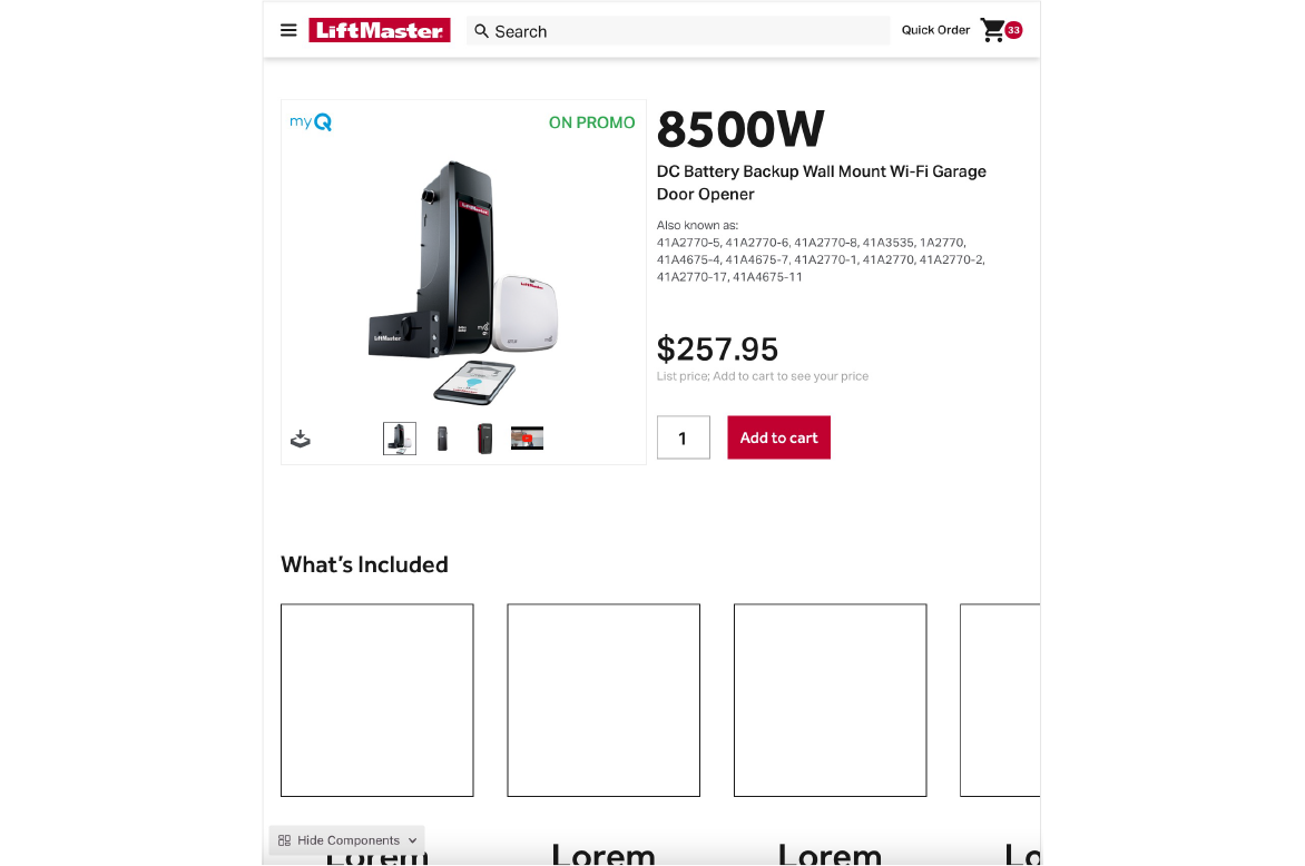
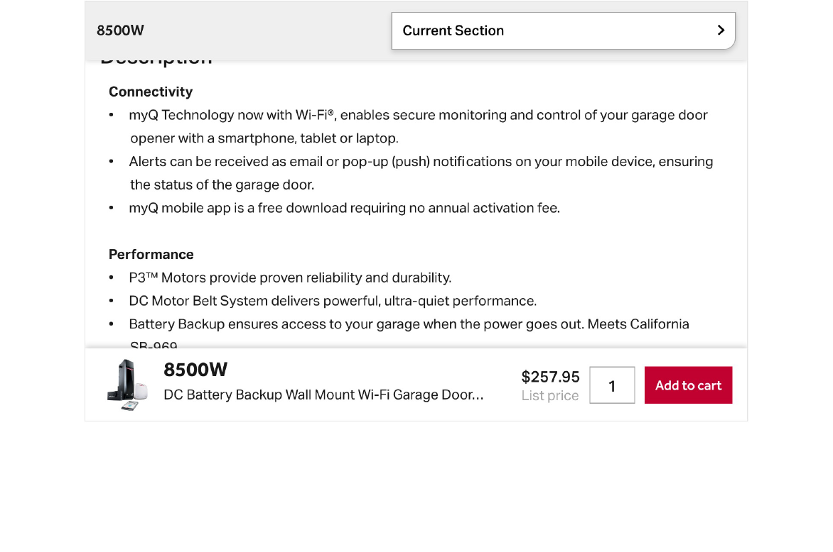
All PDP Tablet versions have 2 sticky elements so they are easier to navigate. On the top, there's a dropdown allowing the customer to navigate throughout sections within the page. The bottom contains a photo of the product, the products name, short description, price and ability to quickly add to cart.
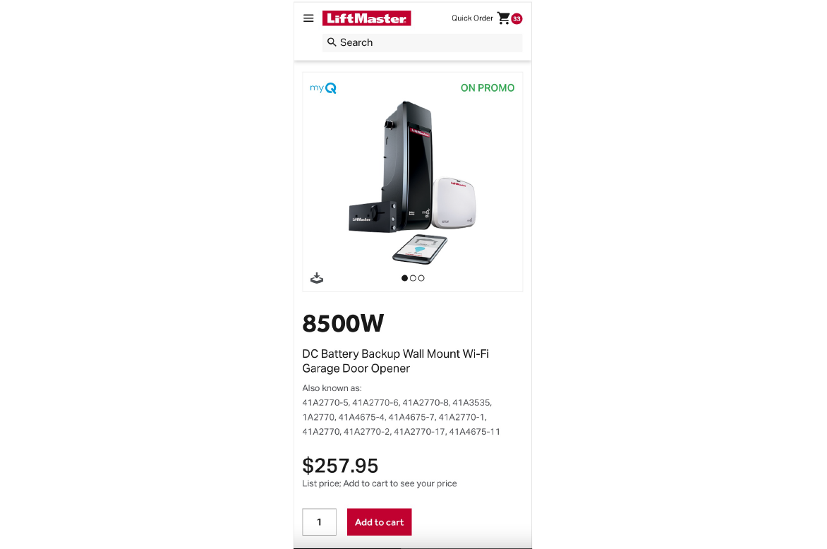
The new clean Mobile PDP places the product photos front and center. The product name and description are now displayed in a clear visual hierarchy, and it’s now easier for the customer to view the price and then click the call-to-action button. All PDP’s now contain a sub navigation making it easier to navigate throughout the page.
All Mobile versions of the PDP's have 2 sticky elements to make the screen easier to navigate. On the top, there's a dropdown which contains the on page navigation to allow a customer to navigate throughout sections within the page. On the bottom contains a the price and ability to quickly add to cart.
Web Application Prototype
FedEx
Challenge
FedEx was using a combination of a web application as well as some manual tools (such as email and Excel) to manage their quarterly global simulation process. IA Collaborative brought me on the Global SIMS (simulation) project to help define, reimagine, and design a new web application based on common scenarios we heard from research to ensure FedEx customers receive the sales coverage and service they need.
Role
- Sr. UX Designer
- Participated in research workshops
- Co-designed site map
- Co-designed process flows
- Co-created wireframes
- Co-created prototype
- Led some of user validation sessions
Results
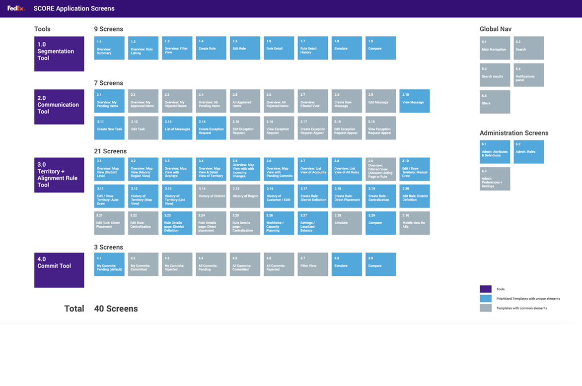
We prototyped over 15 flows for users to test across different roles, activities, and scenarios. The prototype which consisted of 4 tools, 140 screens, and had 30+ observers and participants help reimagine FedEx’s Global SIMS process.
The new design could accelerate decision-making, significantly reduce corrupted time, allow greater ability to keep up with dynamic market needs, more accurate customer segmentation, greater collaboration across sales, and reduce communication times.
Sitemap
Flows & Frames
Segmentation Rule Tool
For GSO and Regional Leads to review, manage and preview the impact of new or updated segmentation rules that apply globally or by specific region
Before
Handled through emailed Excel spreadsheets, aggregated by GSO and updated in code by the GSO execution team


This screen allows to you easily compare the proposed rule versus the current active rule so it's clear what the overall impact would be prior to its implementation. It also offers a quick Pros / Cons which provides a quick summary for the person making the decision. The person has the ability to view this in a column, graph, or map view.
Communication & Workflow Management Tool
Provide a centralized location to manage, act on, and track communications around the SIMS process, that integrates with other tools like email or instant messaging.
Before
Email


Alignment Rule Management & Territory Balancing Tool
For GSO, VPAs, and Regional Leads to review, manage and preview the impact of new or updated alignment rule that apply to regions/districts/territories or to specific customers (through centralization or direct placement)
For VPAs, Regional Leads, and DSM/Admins to review, manage and preview the impact of changes to territory definitions, and create alignment based rules from visual territory definitions.
Before
Handled in the WBA - 7-9 clicks


Commit List Management Tool
To provide a final check and assessment of submitted commit candidates for approval and execution.
Before
Current engine run process


User Research

We prototyped over 15 flows for users to test across different roles, activities, and scenarios. The goal was to validate the designed features in person with 6-8 participants over the course of 2 days and gather feedback and integrate into final designs and handoff.
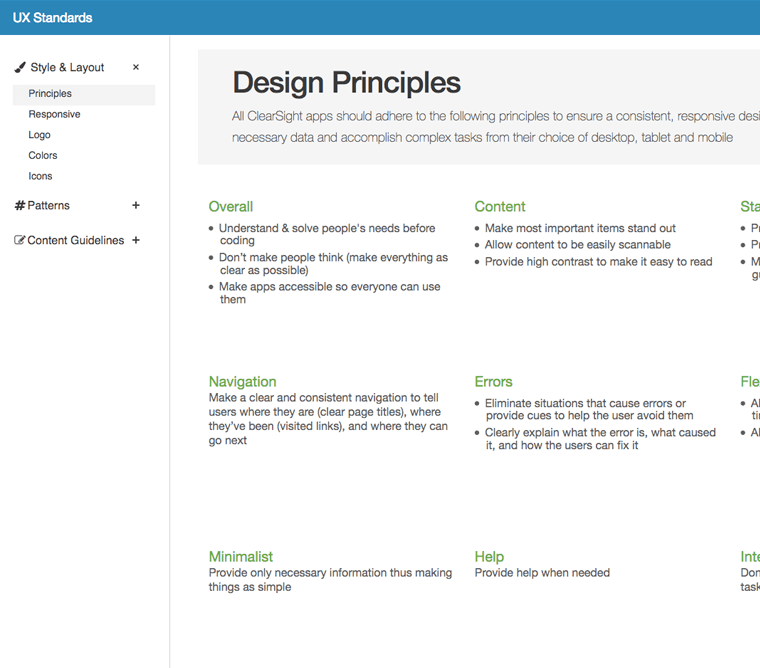
Design System
Marsh Clearsight
Challenge
Clearsight didn't have many existing standards as each team would often decide how they wanted their applications to work and look. The challenge was to identify, create, and provide a way to share standards across multiple teams.
Role
- Managed project
- Researched all existing applications
- Conducted competitive analysis
- Designed site map
- Created pattern listing
- Wrote up each pattern
- Designed and developed site
Results
The new site which contains standards for style & layout, UI patterns, and content guidelines was a huge win as it's already improving consistency.
URL: Internal website
Flows & Frames
One of my main challanges was to create this design system while managing a team as well as working on an existing high profile project. The first step, in this 4 month project, was to indentify all of the existing elements, visuals, and content. I then standardized each and grouped them into Style & Layout, Patterns, & Content Guidelines.
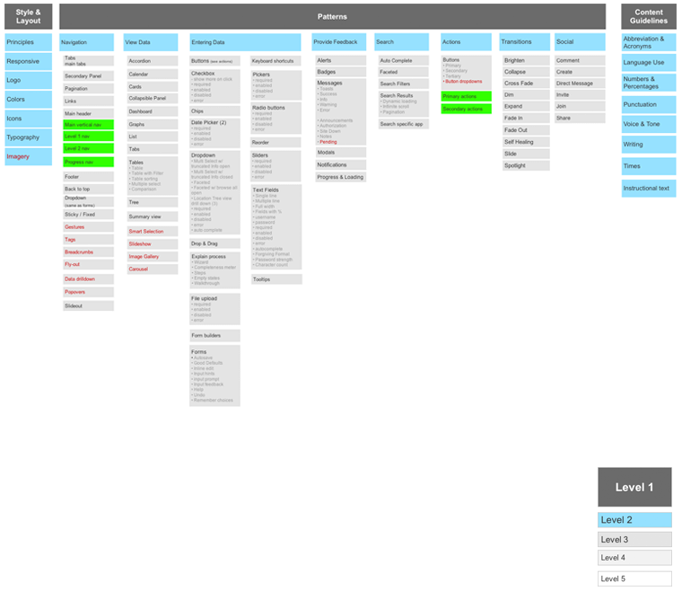
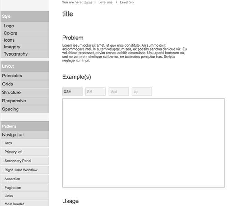
Visuals
New Customer Welcome Center Website
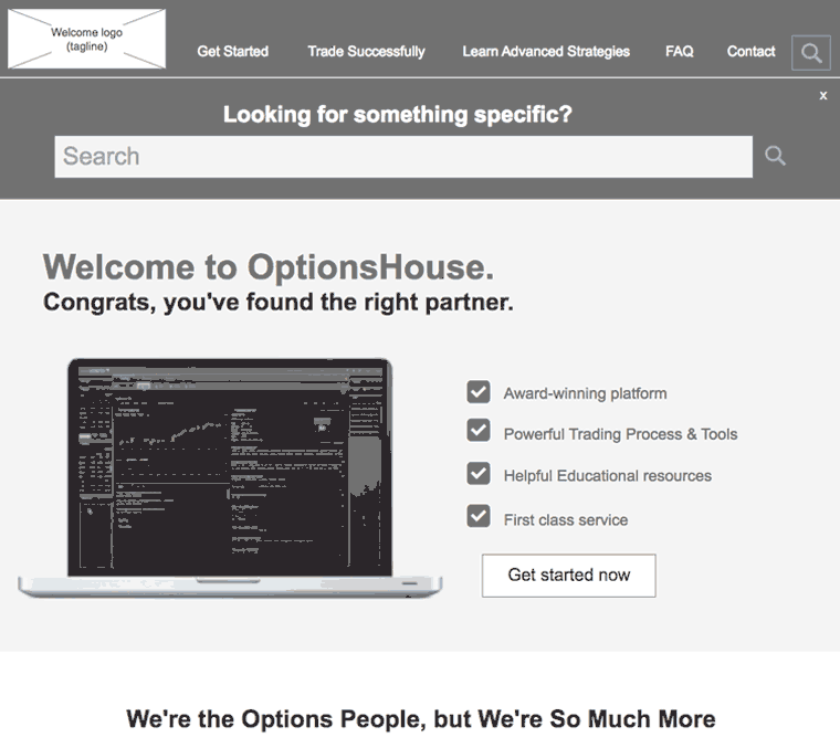
OptionsHouse
Challenge
OptionsHouse, a part of E*TRADE, was looking for a new customer welcome center website to help new customers get up and running as quickly as possible.
Role
- Lead discovery tasks
- Created stakeholder questions
- Conducted stakeholder interviews
- Performed heuristic evaluation
- Completed competitive analysis
- Created sitemap
- Designed wireframes
Results
The new welcome site allows users to quickly get up to speed and start trading immediately, provides information to common issues, and gives customers a trading edge.
URL: no longer live
User Research
Option's House main issue was that new traders often overrate their trading ability and quickly lose their money and then disengage. We wanted to better understand why.
Analyzed OptionsHouse plus 3 competitors based on the following main criteria: Brand, UX, and Content. Analysis was then summarized in a presentation.
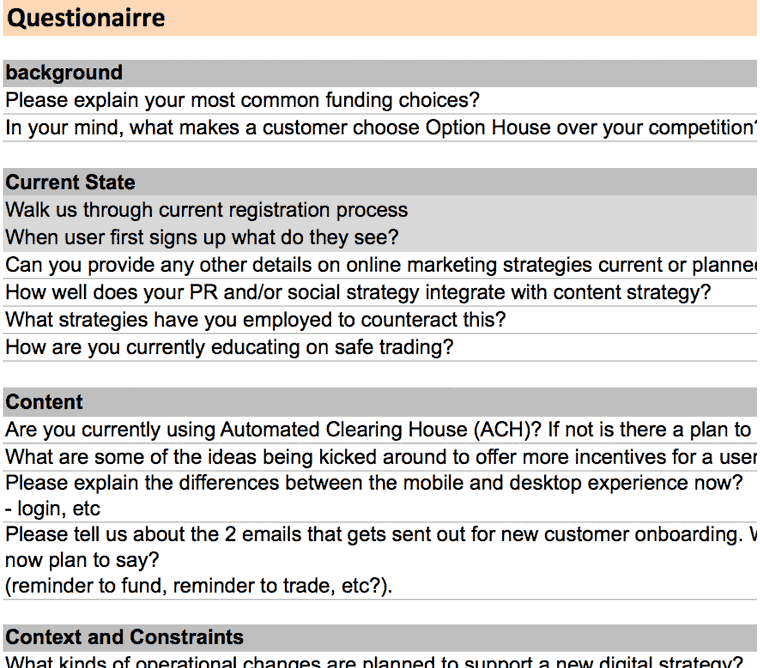
Created and organized questions, led interviews with 5 key stakeholders, and synthesized what was seen and heard.
Sitemap
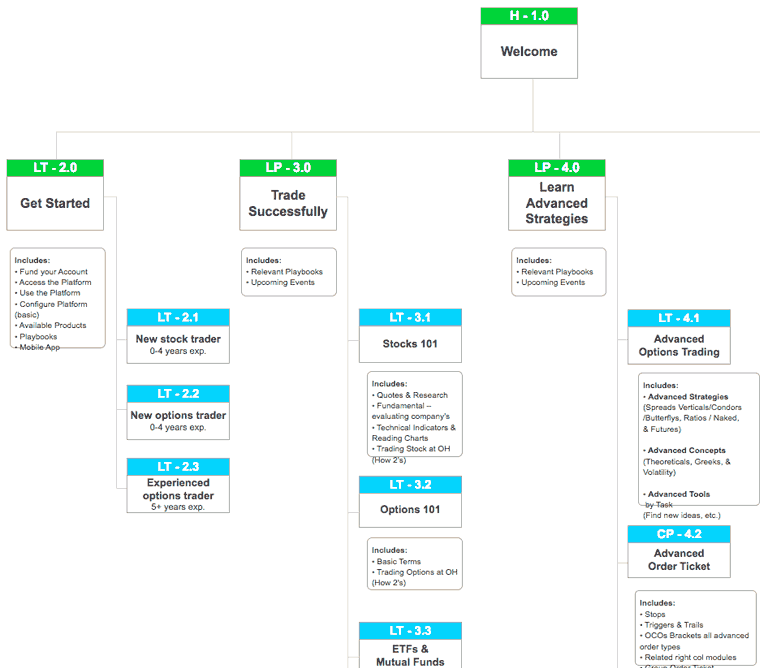
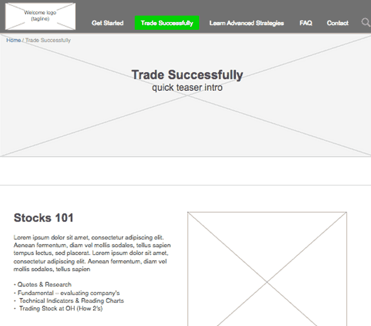
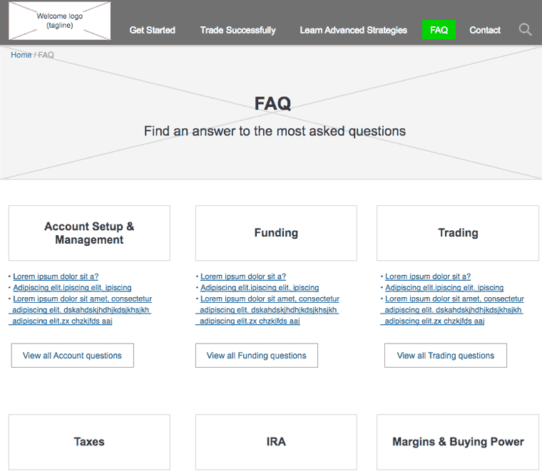
Organized content into the following major categories: Getting started, Training, Strategies, Products and Services, and FAQ
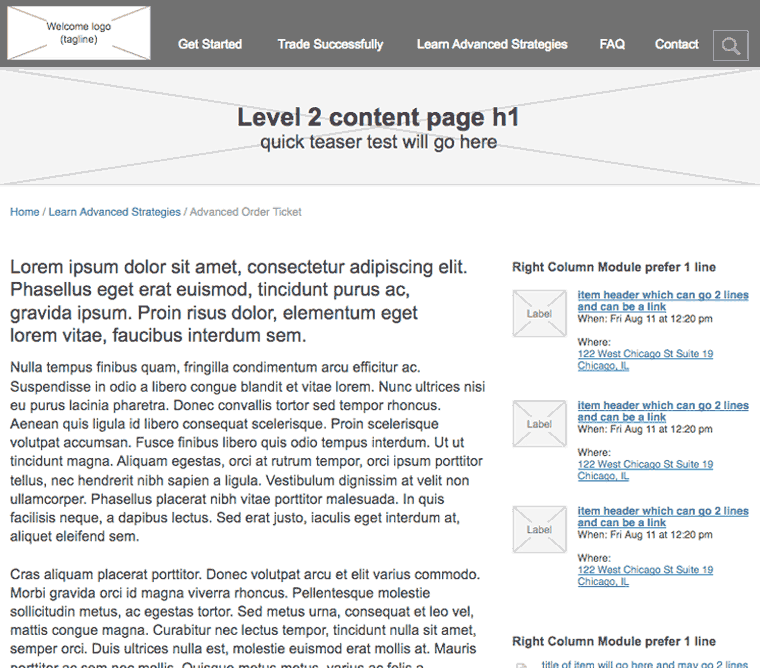
Wires
The wires for the new Welcome center solved 3 main goals:
1) Welcome new customers to OptionsHouse
2) Help new customers get up to speed and start trading quickly
3) Create and intuitive experience for new customers that need help

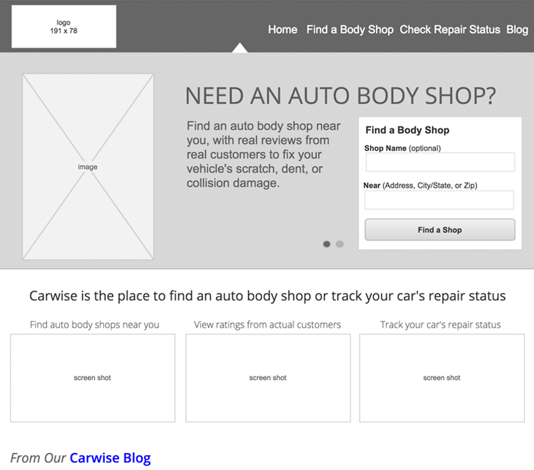
Responsive Body Shop Finder Site
Carwise.com
Challenge
CCC had been extremely successful providing both insurance companies and auto body shops the data they need to help customers. Carwise was CCC's first attempt to enter into the consumer space.
Role
- Conducted usability evaluation
- Designed Process Flows
- Created Wireframes
- Wrote copy & created messaging
- Contributed to SEO
- Coded HTML/CSS templates
- Created visual design
- Worked closely with developers
- Conducted usability testing
Results
As the Lead User Experience designer throughout this multi-year engagement was responsible for helping grow a site 136% in page views over the last 2 years.
URL: carwise.com (homepage has changed)
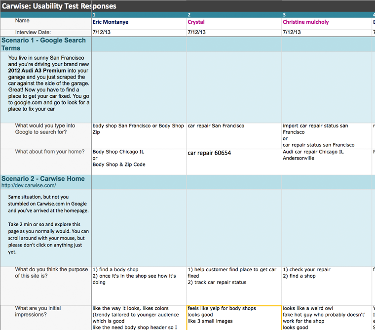
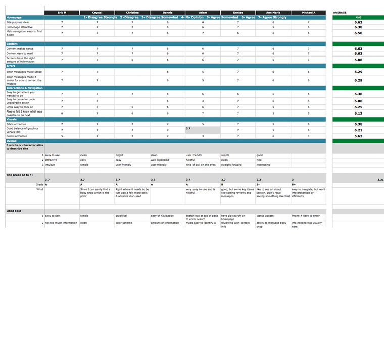
User Research
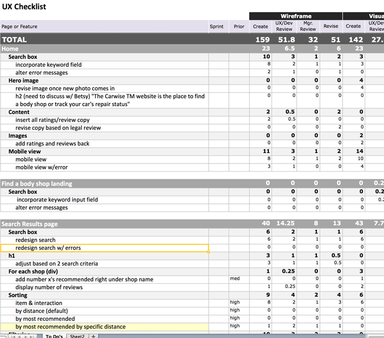
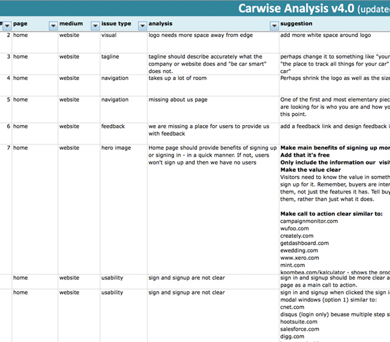
Content

Process Flows
Wires
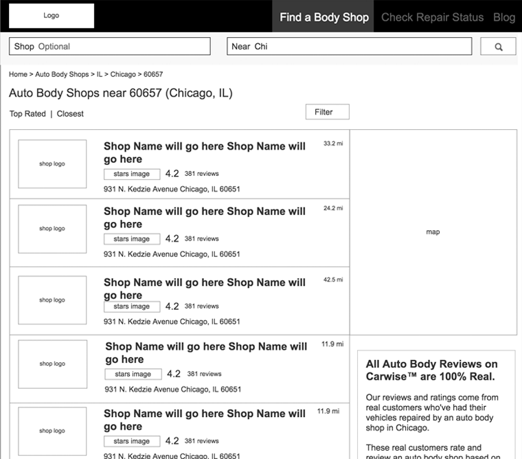
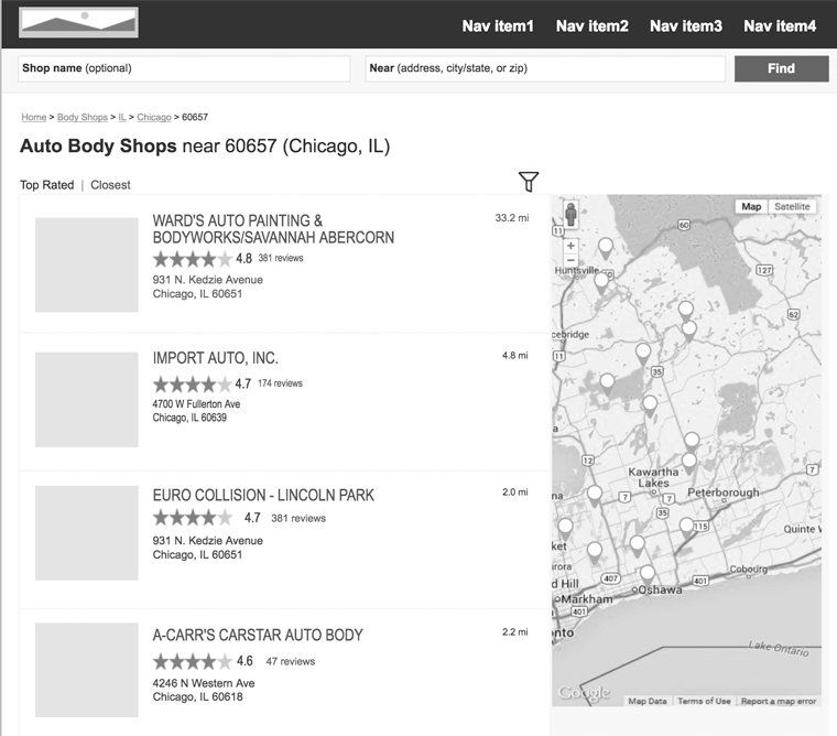
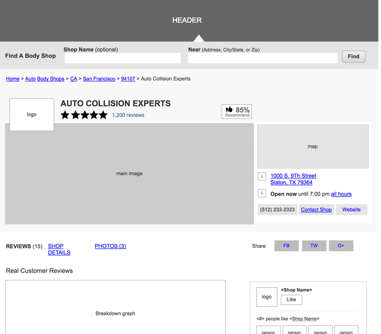
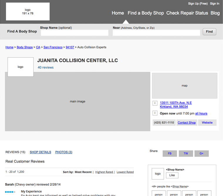
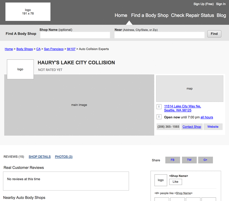
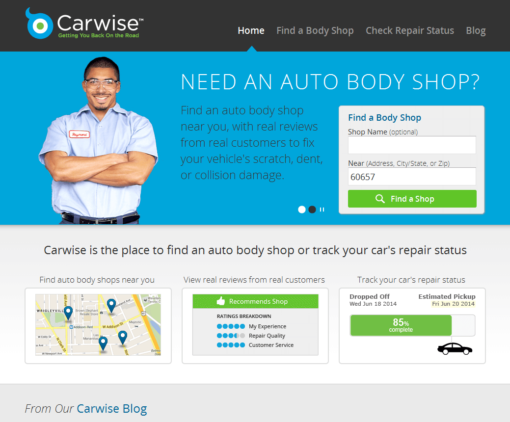
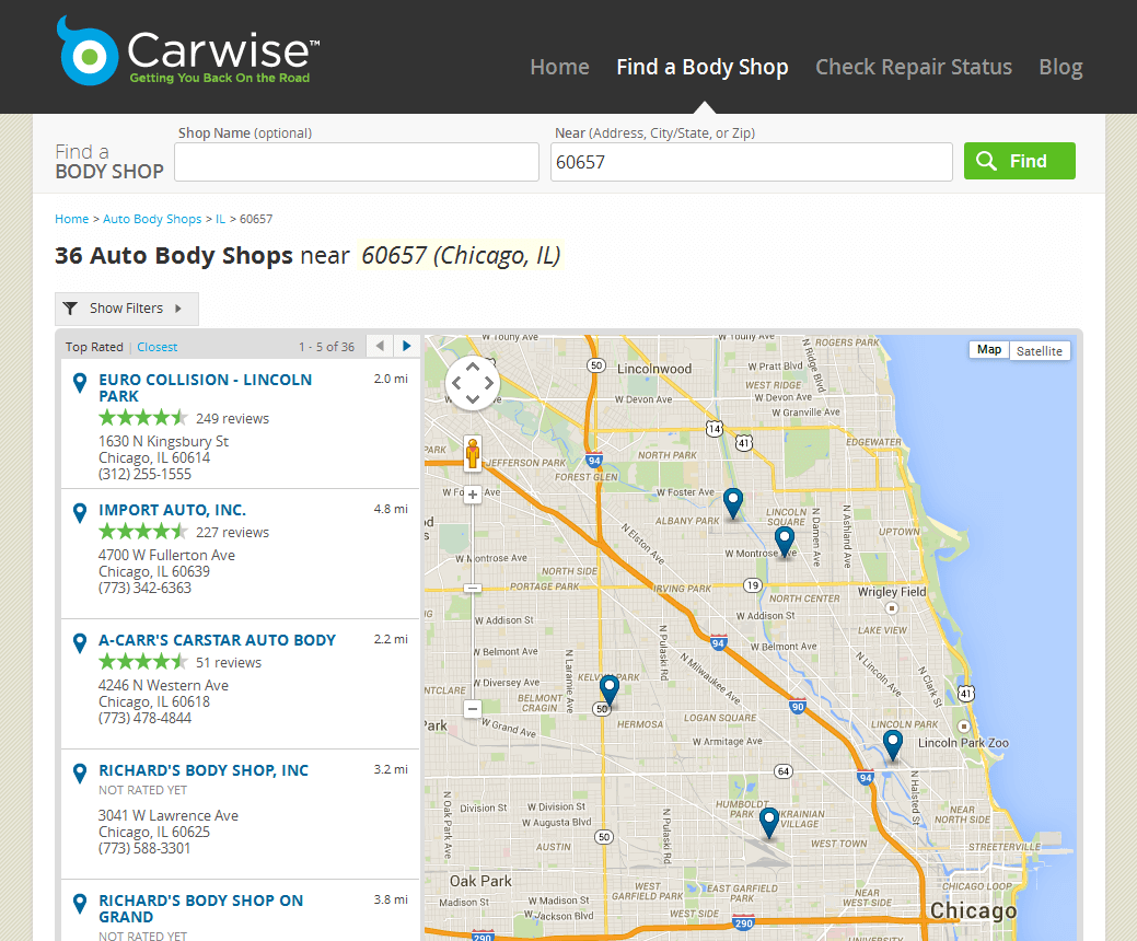
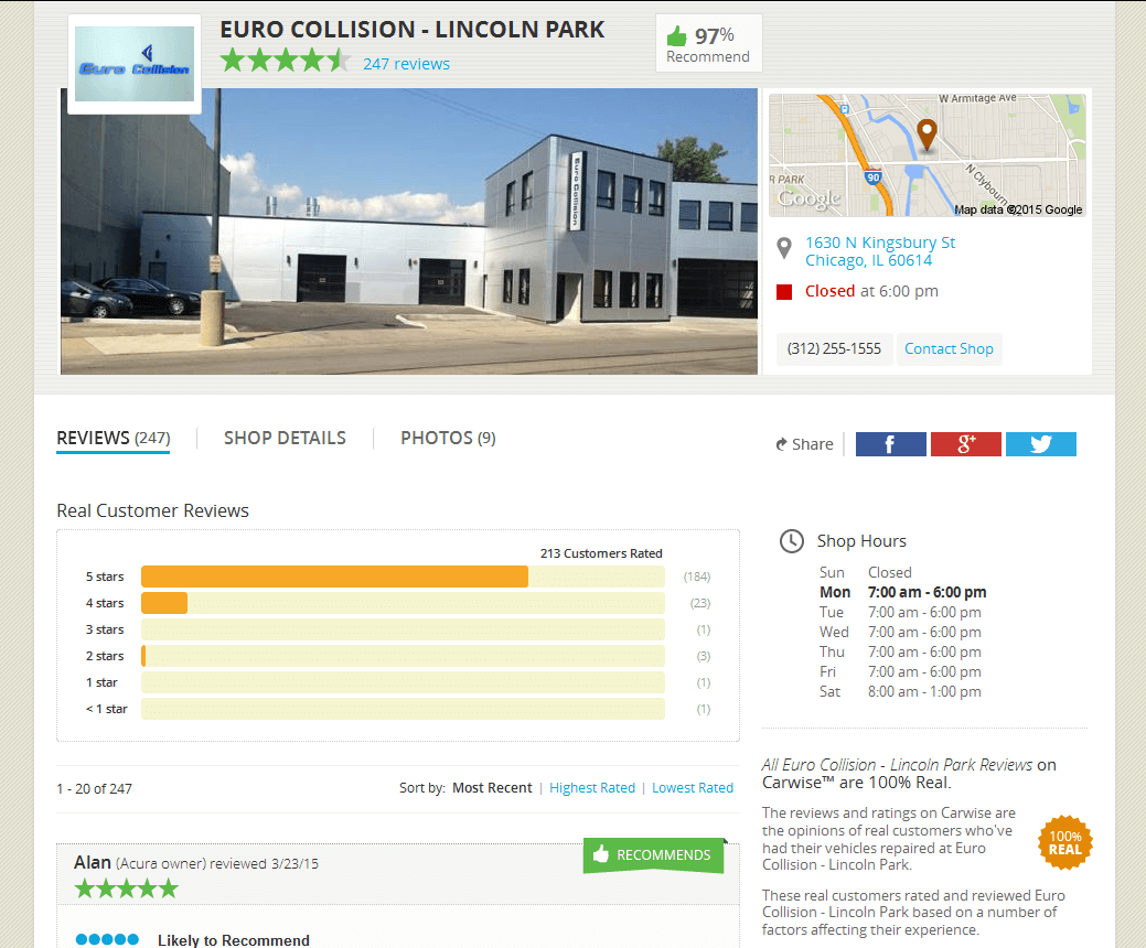
Visuals
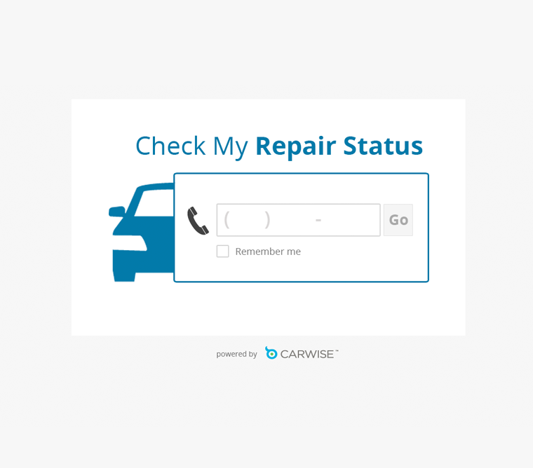
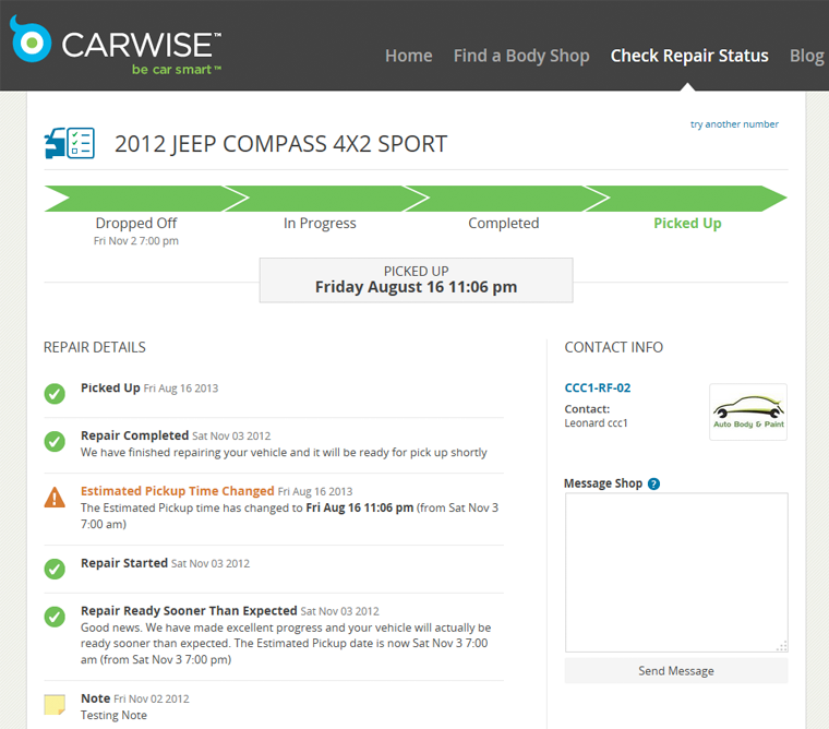
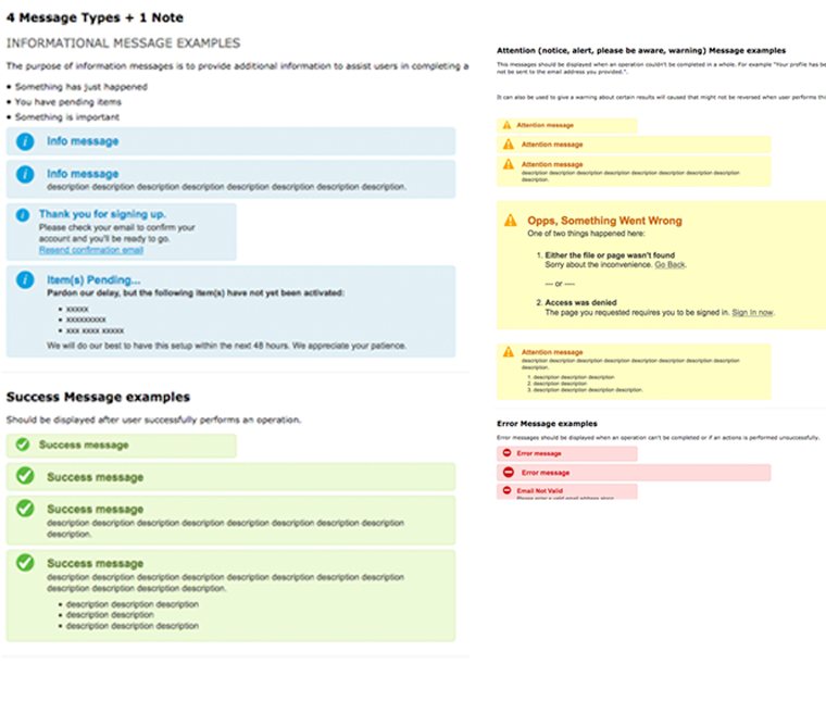
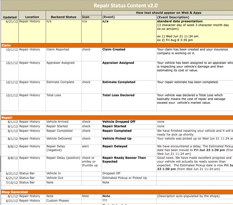
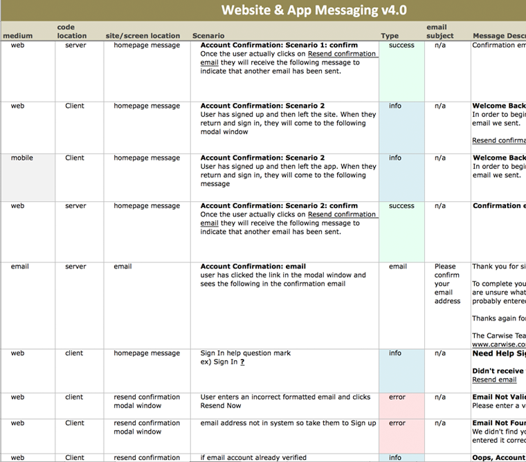
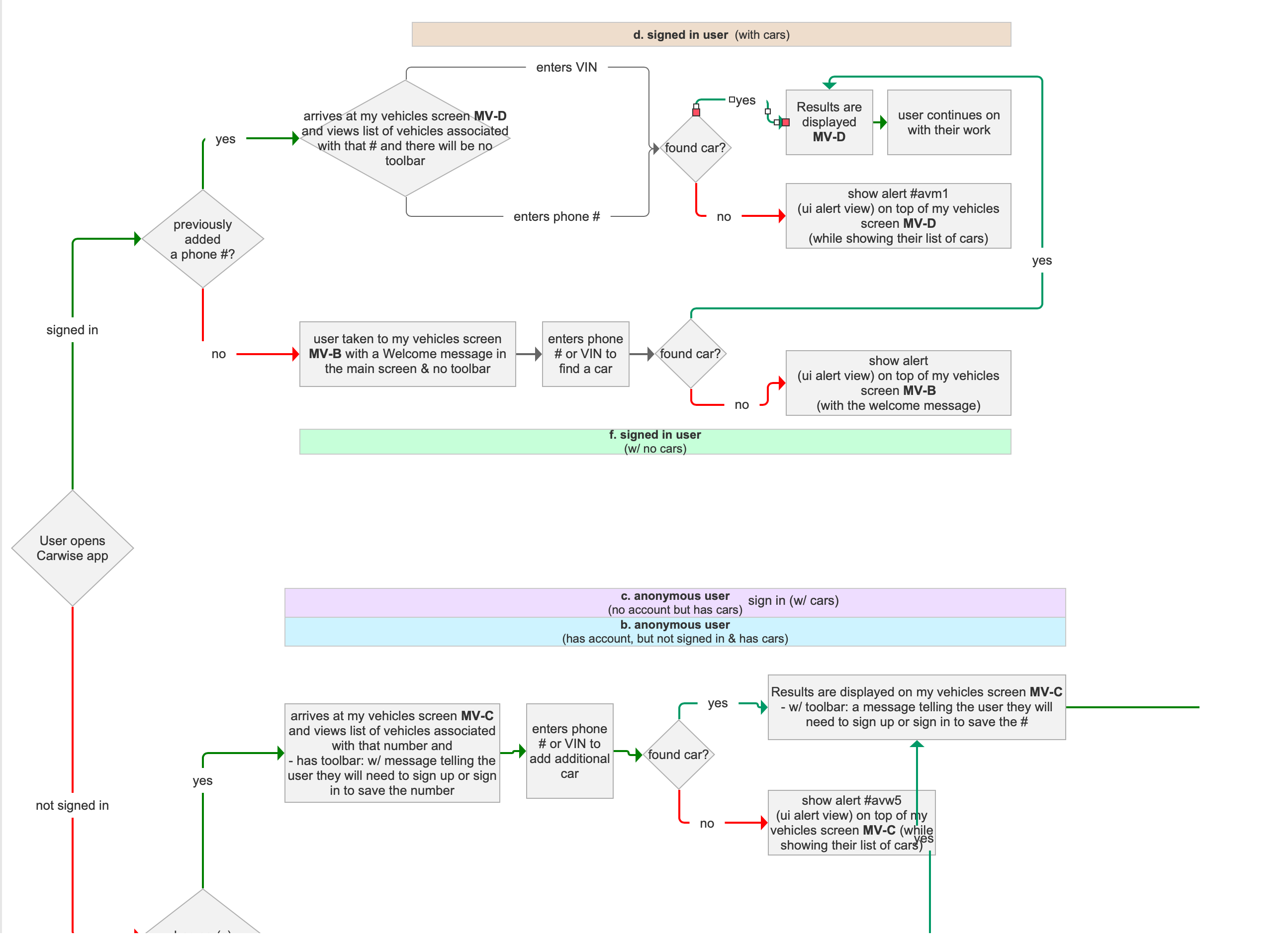
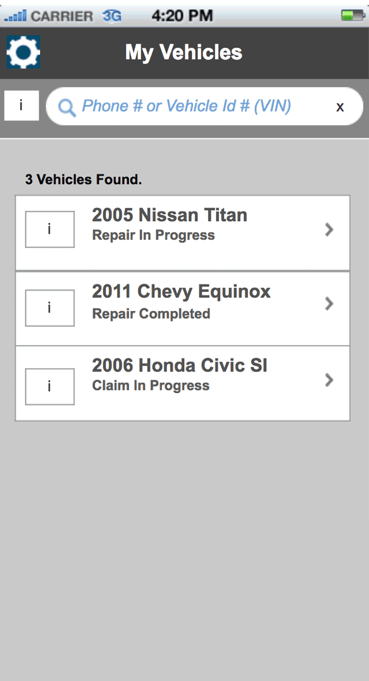
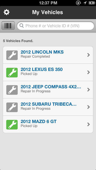
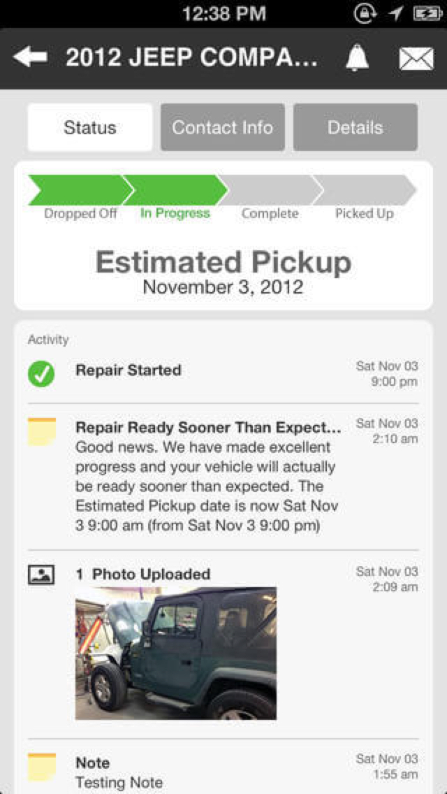
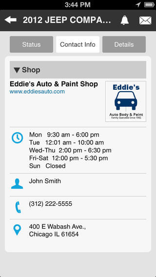
Auto Repair Status iPhone App
Carwise
Challenge
Improve upon the existing Carwise app by making it easier for customers to track their car's repair status.
Role
- Reviewed user research
- Designed process flows
- Created wireframes
- Wrote copy & created messaging
- Created visual design
- Worked closely with developers
Results
The improved app has a more modern look and also simplified the way users track their car's repair status
Wires
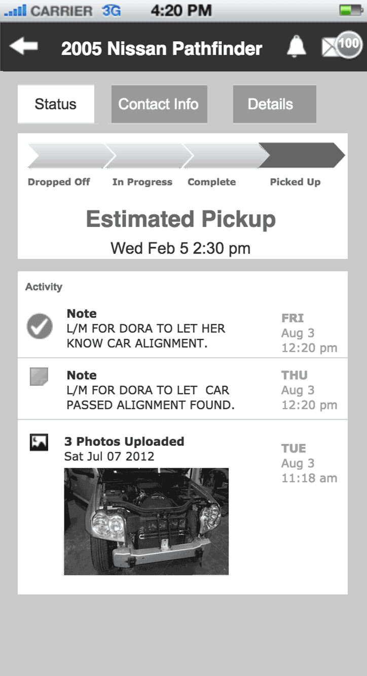
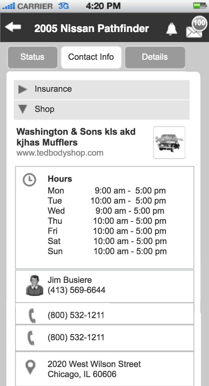
Visuals
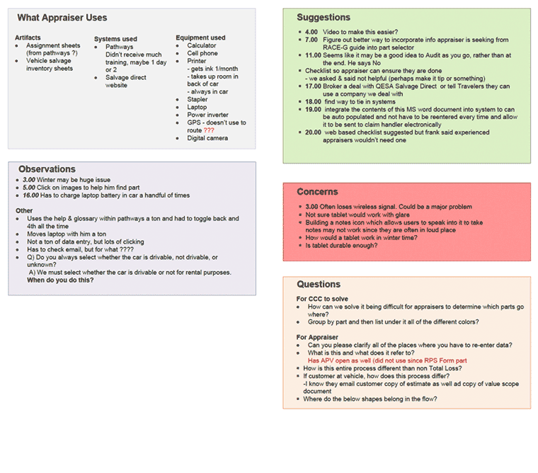
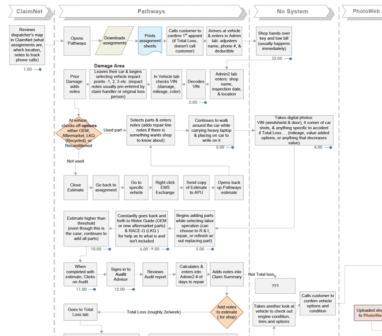
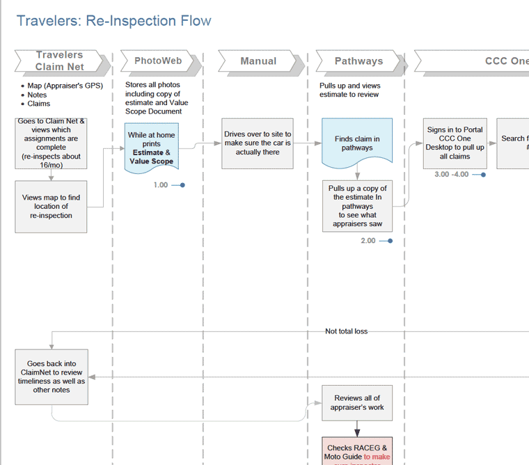
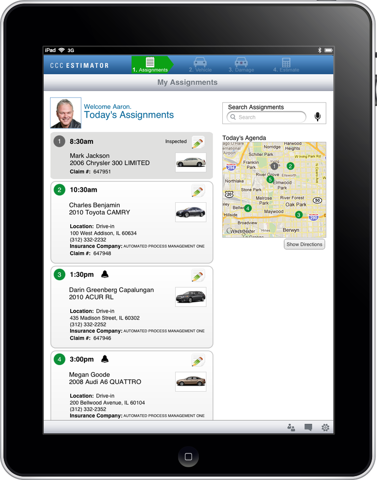
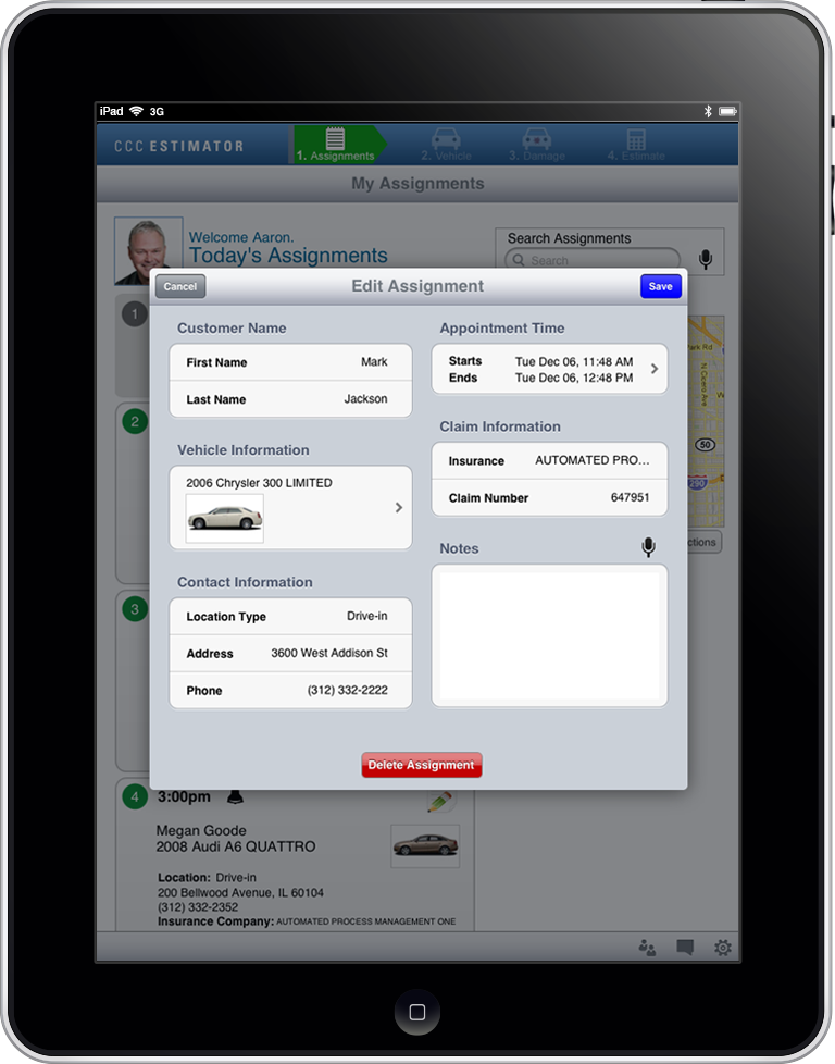
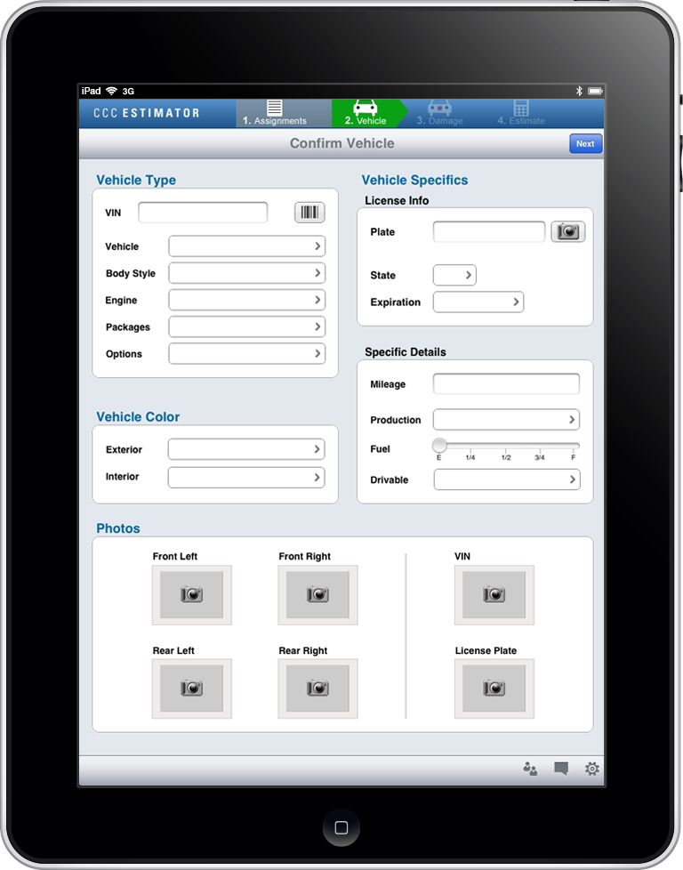
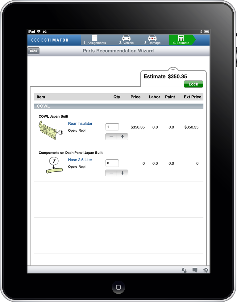
Appraiser Estimating iPad Prototype
CCC Information Services
Challenge
CCC was looking to leverage technology to help appraisers estimate faster once a car has been damaged.
Role
- Conducted contextual inquiry
- Analyzed existing process
- Redesigned process
- Created wires
- Built prototype
- Created visual design
- Presented demo at CIO conference
Results
This iPad application prototype was a hit with CIO's when demo'd at a large insurance conference.
URL: View prototype
Research & Flows
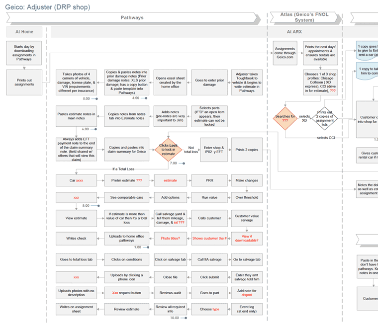
Wires
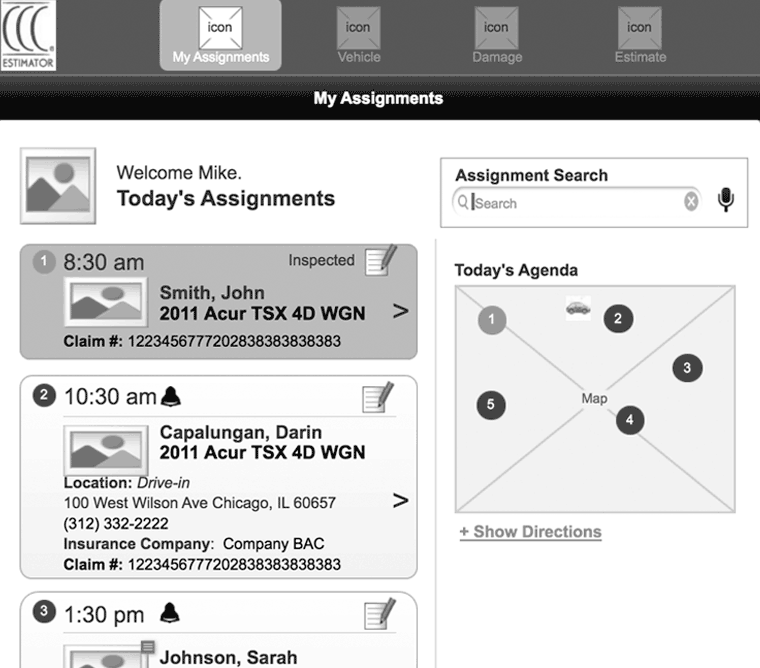
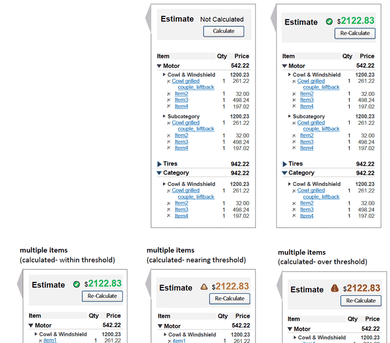
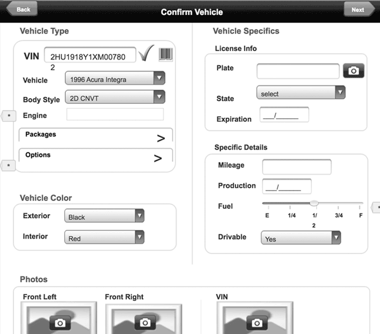
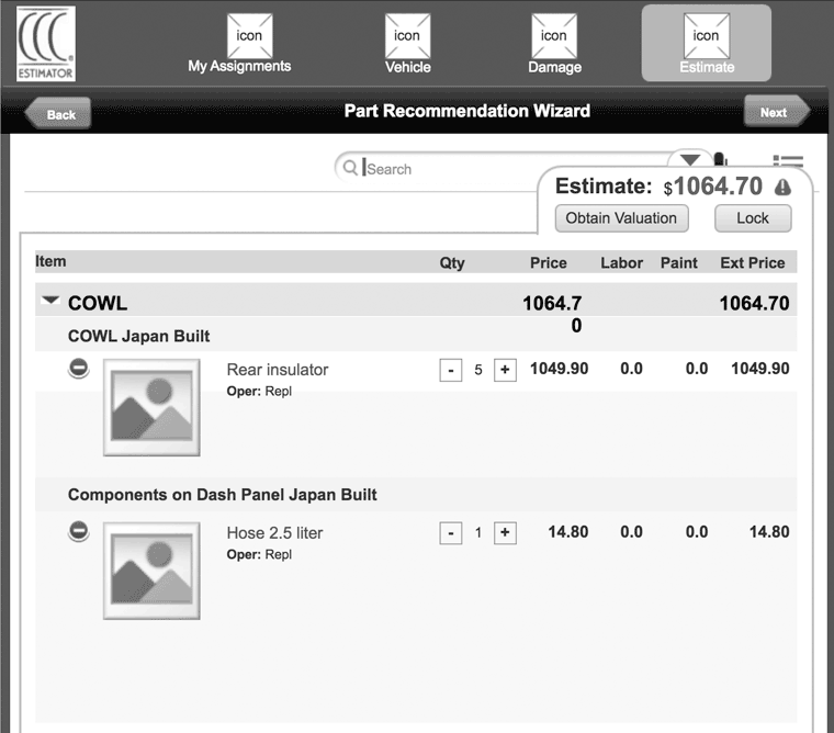
Visuals


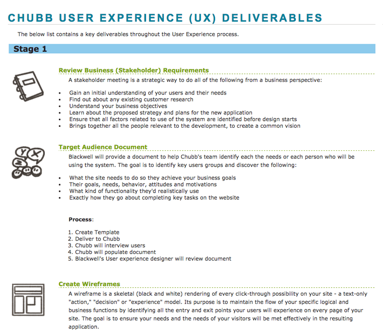
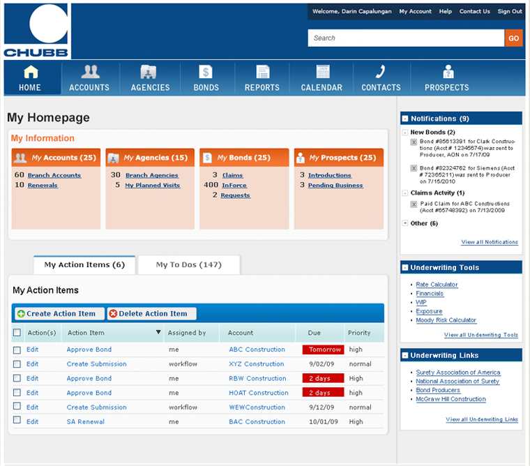
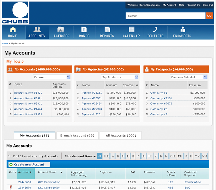
Underwriter Web Application
The Chubb Corporation
Challenge
Client requested screens as to what the UI would look like for this internal application. These screens were needed in a very short timeline of only 2 weeks.
Role
- Researched current product
- Interviewed existing team members
- Created site to explain UX deliverables
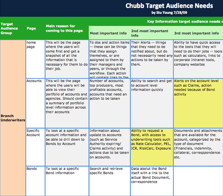
- Created target audience needs document
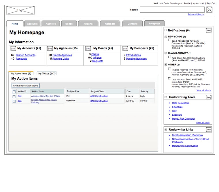
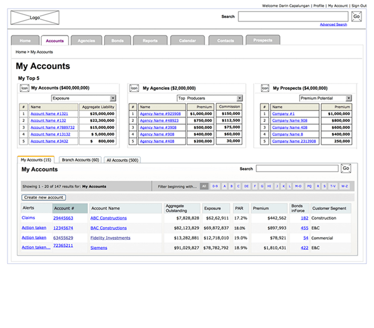
- Designed wires
- Created visuals wires
Results
All deliverables were created in a very tight 2 week period.
URL: Internal web application